Introduction
In this project we will use data from the 2021 Olympics. We will examine two different datasets. First we look at the medals for each team (or country) that obtained at least one medal. Second we will look at the final round discus throws for both men and women.
For the medal data we will use ggplot2 to visualize the number of medals for each team. For the discus data we will determine whether the samples follow a normal distribution using the Kolmogorov-Smirnov test and visual analysis of the data. We also compare the men and women’s results.
Section 1: Loading Packages and Data
Our primary packages for this project will be here, ggplot2, and reshape2 which we load below. We also will use ggpubr for a QQ-plot.
library(here)
library(ggplot2)
library(ggpubr)
library(reshape2)
With our packages loaded we load our data below:
country_medals <- read.csv(here::here("csv", "Olympics2021", "country_medals.csv"))
discus_f_finals <- read.csv(here::here("csv", "Olympics2021", "discus_f_finals.csv"))
discus_m_finals <- read.csv(here::here("csv", "Olympics2021", "discus_m_finals.csv"))
Section 2: Country Medals
Our goal in this section is to create a visualization to showcase the top 20 teams (ranked by number of medals) in the 2021 Olympics. We do this by creating a stacked bar-chart which splits the medals into bronze, silver and gold.
Our first step is to extract the top 20 teams by rank. We then remove unneeded columns from the original dataset, keeping only the team name and the medal counts for bronze, silver and gold for each team. This sets us up to use the melt function from the reshape2 package to transform our data from a wide dataframe to a long dataframe.
# keep top 15 countries by rank
df <- country_medals[country_medals$Rank <= 20, ]
# remove unneeded columns
df <- df[, 2:5]
# create long dataframe with melt function
df_long <- melt(data=df,
                id.vars="Team.NOC",
                variable.name="Medal",
                value.name="Count")
Now that we have a long dataframe we can use ggplot2 to create a stacked bar-chart. Our steps are included in the code block below.
my_colors <- c(Bronze="#cd7f32",
               Silver="#C0C0C0",
               Gold="#FFD700")

lg <- "#A4C9B7"
lb <- "#bdcbd3"
db <- "#92a8d1"

ggplot(df_long, aes(x=Count,
                    y=reorder(Team.NOC, Count),
                    fill=Medal,
                    label=Count)) +
    geom_bar(stat="identity") +
    theme(panel.background = element_rect(fill=lg),
          plot.background = element_rect(fill=lb),
          panel.grid.major = element_line(color=lb),
          panel.grid.minor = element_line(color=lb),
          legend.background = element_rect(fill=db),
          legend.key = element_rect(fill=db)) +
    scale_fill_manual(values=my_colors) +
    ggtitle("Top 20 Olympic Teams by Rank") +
    labs(x="Number of Medals", y = NULL) +
    geom_text(position=position_stack(vjust=0.5))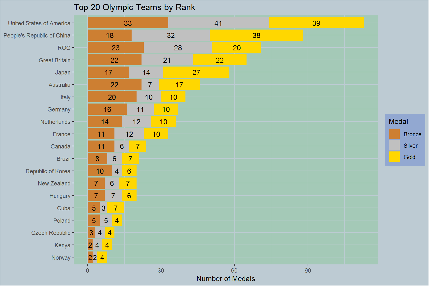
With the above graphic we can see that the United States has the most medals and most gold medals. In second we have China with 38 gold medals. In fifth place we have Japan. Japan is interesting since it has almost as many gold medals as both other medals combined. Since we are not working with data on team placement below the third place, bronze medal, it is hard to say if perhaps Japan had fewer athletes competing and only sent their best or if the result is more luck based.
Section 3: Discus Throw Results.
In this section we will test for normality and see if there is a significant different in the final round between male and female throws. To begin with, let’s take a quick look at mean distances, given in meters, between female and then male throws
# mean female throw distance
(m_f <-mean(discus_f_finals$Result))
## [1] 63.50583# mean male throw distance
(m_m <- mean(discus_m_finals$Result))## [1] 64.72917As we can see the average throw for males in the final round of the Olympics is slightly higher than the average throw distance for females. This does not seem to be a significant difference. Note that women throw a 1kg discus with a 18cm diameter while men throw a 2kg discus with a 22cm diameter. Regardless of the size and weight differences we will only compare the throw distances. Below we manipulate our data to allow for easier data analysis.
# Set up discus data for use
set.seed(100)
normaldist <- rnorm(12)

# add columns to differentiate male and female throwers
discus_f <- data.frame(discus_f_finals, Gender="F")
discus_m <- data.frame(discus_m_finals, Gender="M")
# combine male and female throwers
discus <- rbind(discus_f, discus_m)
With our data cleaned a bit, we want examine our data points. To do this, we plot two QQ-plots below. The first is done with ggplot2. The second uses ggpubr and shows 95% confidence intervals.
ggplot(discus, aes(sample=Result)) +
    stat_qq(aes(color=Gender)) +
    scale_color_manual(values=c("red", "blue")) +
    labs(y="Distance (m)")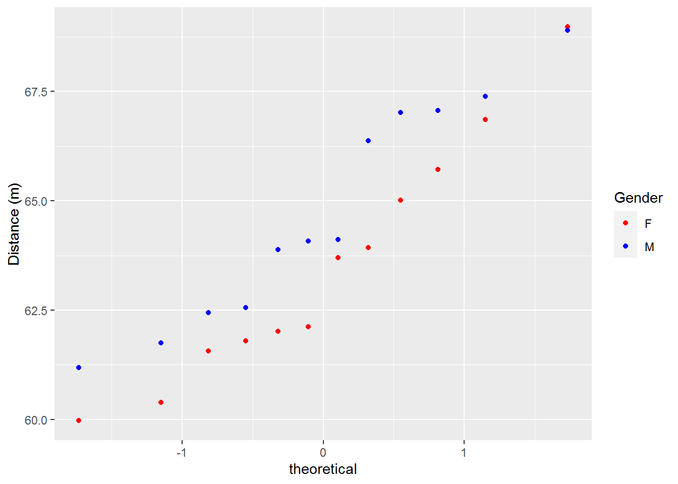
ggqqplot(discus, x = "Result",
    color = "Gender",
    palette = c("red", "blue"),
    ggtheme = theme_pubclean()) +
    labs(y="Distance (m)")
Based on the plots above our data appears to be normal and both distributions appear to be similar. Let’s take a closer look and see if that is indeed the case.
Below we create a function that we will use to print out a histogram of our data as well as return the results of a Kolmogorov-Smirnov test. The Kolmogorov-Smirnov test is a powerful non-parametric statistical test for testing whether two distributions are the same. In this function we use the test to determine whether or not our distributions are normal using R's built in ks.test function.
check_normal <- function(df, title=NULL) {
    p <- ggplot(df, aes(x=Result)) +
        geom_histogram(aes(y=..density..),
                       binwidth=2,
                       colour="black", fill="white") +
        geom_density(alpha=0.2, fill="#26b430") +
        labs(x="Distance (m)") +
        ggtitle(title)

    print(p)
    results <- df$Result
    ks.test(results, pnorm, mean(results), sd(results))
}
Our first check, with our new function, is to determine whether or not the female discus throw results are normally distributed.
check_normal(discus_f, title="Female Results")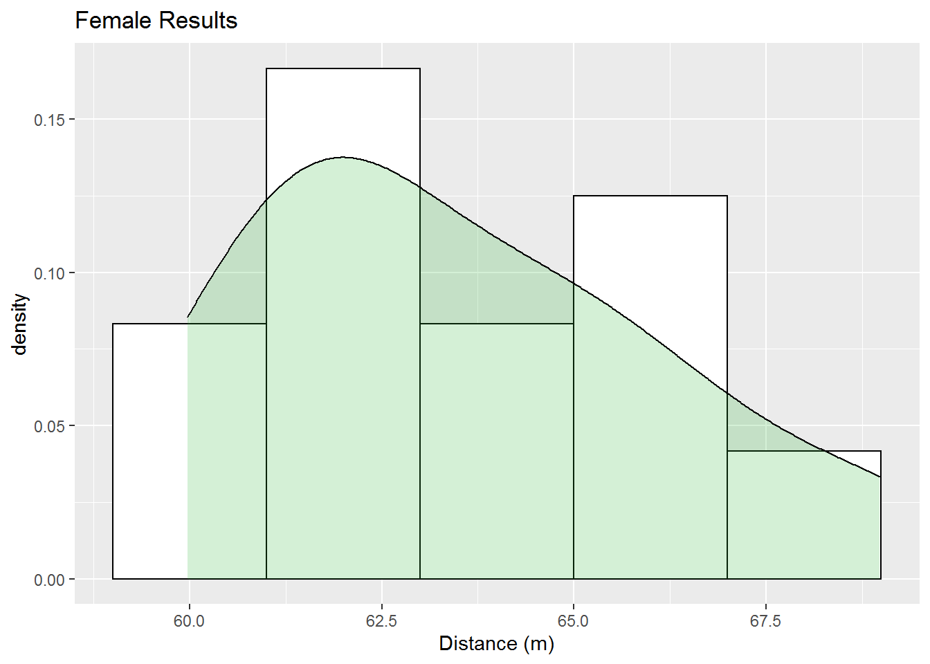
##
##  One-sample Kolmogorov-Smirnov test
##
## data:  results
## D = 0.19456, p-value = 0.6855
## alternative hypothesis: two-sided
Using the Kolmogorov-Smirnov test with null hypothesis that the female throws follow a normal distribution, we get a p-value of 0.6855 from which we conclude that we lack enough evidence to say our distribution is not normal. Our histogram also seems to back up the assertion that we cannot rule out the posibility of a normal distribution, though it doesn’t appear very normal. Likely we need more data to get more meaningful results. Below we look the male throwers’ results.
check_normal(discus_m, title="Male Results")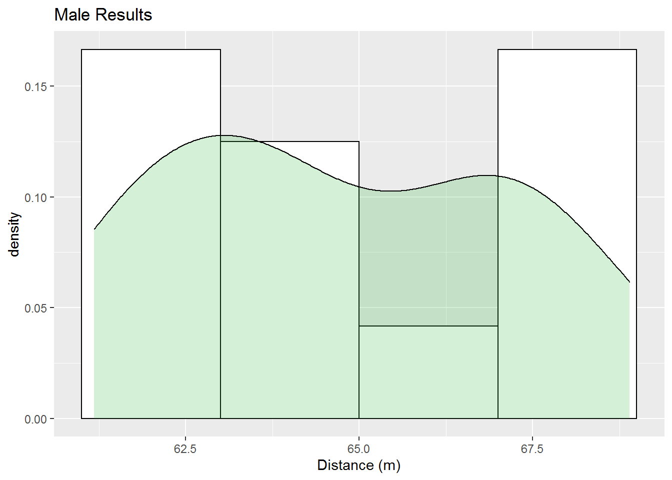
##
##  One-sample Kolmogorov-Smirnov test
##
## data:  results
## D = 0.17971, p-value = 0.7712
## alternative hypothesis: two-sided
This Kolmogorov-Smirnov test also has a large p-value. So we cannot use it to say the distribution is not normal. On the other hand we can clearly see two peaks in our data in the histogram indicating that these results are not very likely normal. So what about the male versus the female results? Below we use the Kolmogorov-Smirnov test on these two distributions.
# check if male and female distances are statistically different
ks.test(discus_f$Result, discus_m$Result)
##
## Two-sample Kolmogorov-Smirnov test
##
## data: discus_f$Result and discus_m$Result
## D = 0.33333, p-value = 0.5361
## alternative hypothesis: two-sidedAs with our two previous tests we lack the evidence to conclude that these two distributions are different. Below we look at the distributions of these two datasets against each other.
discus_means <- data.frame(Gender=c("F", "M"),
Result=c(m_f, m_m))
ggplot(discus, aes(x=Result, fill=Gender)) +
geom_density(alpha=0.3) +
geom_vline(data=discus_means,
aes(xintercept=Result, color=Gender),
linetype="dashed", size=1) +
labs(x="Distance (m)")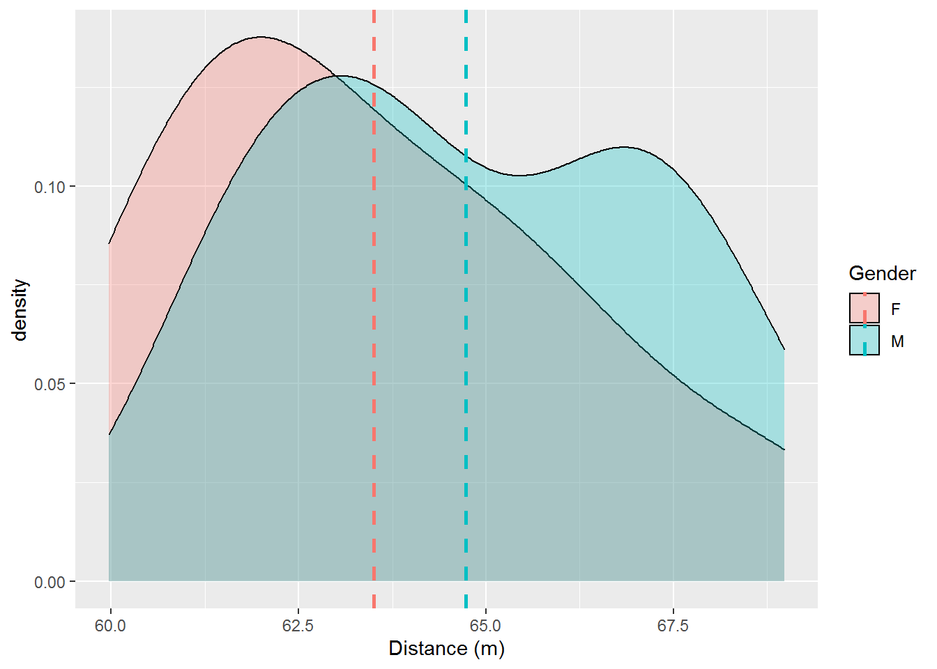 We can see that there are some similarities, but the two distinct peaks for the male distribution clearly represent a difference at least for these two samples.
In conclusion it appears that we cannot definitively say that the distributions are not normal nor that they follow different distributions from the Kolmogorov-Smirnov test. From a graphical perspective, however, it seems likely that these distributions are neither normal nor the same. Note that getting more data such as the semi-finals or from previous Olympics could help us overcome these limitations to some degree. Of course using previous Olympics could be problamatic due to possible changes in regulations and the passage of time.
Conclusion
With hundreds of medals being given out during the 2021 Olympics for a variety of events, their is a great opportunity for exciting data analysis to be done using the Olympics data. We could compare results over time and try to determine which sports have become more competitive and which have become less competitive. Someone could also try to determine if the Olympics are more popular to viewers in current years or less popular by collecting and analyzing data on television and internet views.