In this post our goal is to graph spatial and spatio-temporal areal data for unemployment rates in Missouri counties. The data was obtained from the Federal Reserve Bank of St. Louis. We will create multiple choropleth maps from this data ranging from September 2019 to September 2020.
Our first chunk of code lists the packages in use.
library(dplyr)
library(magrittr)  # for pipe operator %<>%
library(maps)
library(here)
library(xts)
library(spacetime)
library(maptools)
library(RColorBrewer)
library(tools)
library(sp)
library(tmap)
We next load the fips database from the maps package. After this we load the unemployment data for the 115 csv files for Missouri counties (including the St. Louis City region) from their folder.
# load fips database from maps package
data(county.fips)

# read in file names
file_path <- here("csv", "mounem_2020_sept_project")
file_names <- list.files(path = file_path, pattern="*.csv")

# read in each file by name into a list
files <- here("csv",
              "mounem_2020_sept_project", file_names) %>%
    lapply(read.csv)
Once the data is loaded into R we format a data frame st.df in long format.
# reformat files contents as xts objects
files_xts <- files %>%
    lapply(function(x) xts(x[, 2], order.by=as.Date(x[, 1])))

# subset xts data to last 13 months
files_xts %<>% lapply(function(x) x[(length(x)-12):length(x),])

# helper function which takes a file name as input and
# returns the associated county name from county.fips
fip_match <- function(f_name){
    f_fip <- substr(f_name, start=1, stop=5) %>% as.numeric()
    county.fips[which(county.fips$fips == f_fip), 2]
}

# uses the fip_match function to create a list of county names
# given in the same order as associated file names
file_counties <- file_names %>%
    sapply(fip_match) %>%
    unname()

# create a data frame st.df containing county, date and
# unemployment data
# note: we allow variable sizes lengths of files_xts[[x]]
tab <- 1
length <- sum(sapply(1:length(file_names),
                     function(x) length(files_xts[[x]])))
# initiate vectors
County <- character(length = length)
Unem <- rep(0, length = length)
Date <- rep(0, length = length)
for(i in 1:length(file_names)){
    for(j in 1:(length(files_xts[[i]]))){
        County[tab] <- file_counties[i]
        Date[tab] <- index(files_xts[[i]])[j]
        Unem[tab] <- as.numeric(files_xts[[i]])[j]
        tab = tab + 1
    }
}
Date <- as.Date(Date)
st.df <- data.frame(County, Date, Unem)
Now that our data is in long format we create a SpatialPolygons object mo.
# creates spacial framework
mo.map <- map(database="county", region="missouri",
              plot=FALSE, fill=TRUE)
mo <- map2SpatialPolygons(mo.map, IDs=mo.map$names)
With our long format data frame st.df and SpatialPolygons object mo we will create an object of class STFDF. Before doing this, however, we need to ensure that the order of counties is consistent between the two objects. Thus, we reorder by mo.map$names before moving forward.
# extract distinct dates
time <- st.df$Date[1:13]

# reorder st.df with mo.st county order (not true by default)
st.df <- st.df[order(st.df[,2],
                     factor(st.df[,1],
                            levels=mo.map$names,
                            ordered=TRUE)
                     ),
               ]
We check for consistency below.
# ensure reordering is correct (should be 115)
sum(head(st.df, 115)$County==mo.map$names)
## [1] 115Getting 115 shows us that all 115 counties in st.df are in the correct order. We now create our STFDF object mo.st
# create stfdf object
mo.st <- STFDF(mo, time, st.df)
Using stplot from the spacetime package we create a spatio-temporal choropleth for each month from September 2019 to September 2020.
# spatio-temporal plot
mo.st[,,"Unem"] %>%
    stplot(time, col.regions=brewer.pal(9, "YlOrRd"),
           main = "Missouri Unemployment", cuts=9)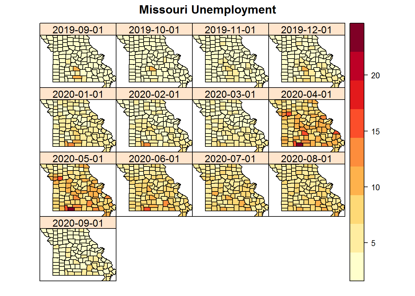
From the graph we can see that unemployment across Missouri spikes around April 2020 and is nearly back to normal by September 2020. We would like to take a closer look at this. Our new goal is to zoom in on the September 2019 and 2020 data and then compare the two. In particular we will look at individual choropleths for each time as well as look at the ratio of September 2020 to September 2019.
Since we will only be looking at an single unit of time or ratio of time based values we will want to work with spatial data as opposed to spatio-temporal data. As such we take our data frame st.df and create sp.df a SpatialPolygonsDataFrame object with all relevant data.
# extract September 2020 data into separate data frame
st.df_small <- st.df[st.df["Date"]=="2020-09-01",]

# clean county identifier from "state, county" to "County"
st.df_small$Names <- lapply(strsplit(st.df_small$County, ","),
                            function(x) toTitleCase(x[2]))

# add September 2019 data as a column
st.df_small$Unem_old <- st.df[st.df["Date"]=="2019-09-01","Unem"]

# find ratio of September 2020 Unemployment to previous September
st.df_small$ratio <- st.df_small$Unem / st.df_small$Unem_old

# Use county names as rownames to allow SpatialPolygonsDataFrame
# to use "mo" our SpatialPolygons data for Missouri counties
rownames(st.df_small) <- st.df_small$County

# create SpatialPologonsDataFrame
sp.df <- SpatialPolygonsDataFrame(Sr=mo, data=st.df_small)
We now use qtm from the tmap package to plot three separate graphs. Note that the legend is not fixed between the choropleths.
# style options:"classic", "white", "gray", "natural"
#               "cobalt", "col_blind", "albatross"
#               "beaver", "bw", "watercolor"

qtm(sp.df, fill="Unem_old", text="Names", text.size=0.5,
    fill.title="Unemployment\n Rate", style="natural",
    main.title=paste("September 2019 Unemployment",
    "for Missouri Counties"))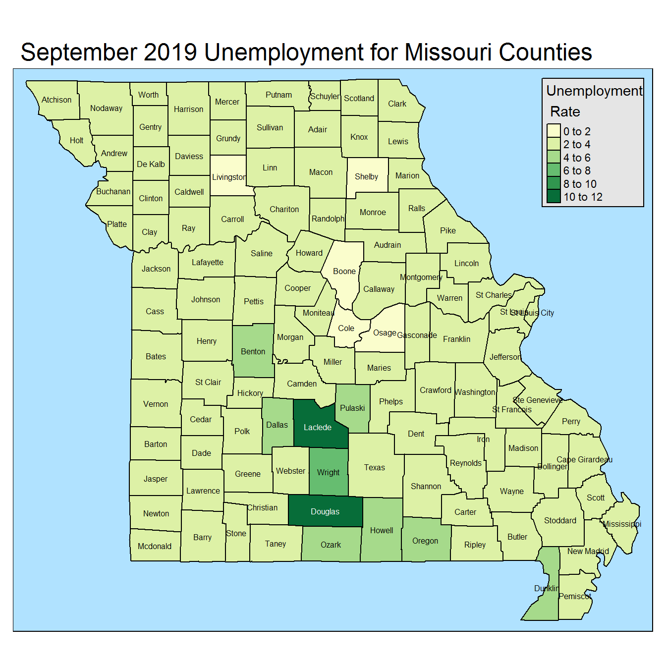
qtm(sp.df, fill="Unem", text="Names", text.size=0.5,
    fill.title="Unemployment\n Rate", style="natural",
    main.title=paste("September 2020 Unemployment",
    "for Missouri Counties"))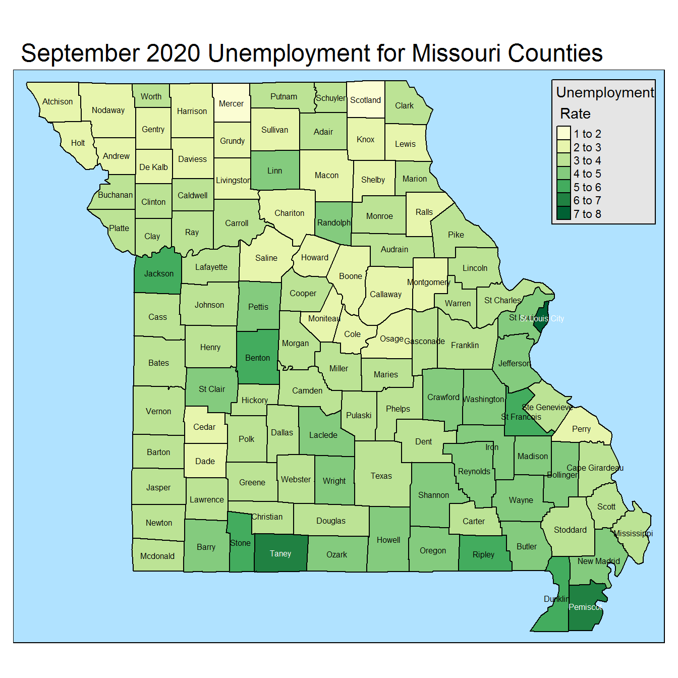
qtm(sp.df, fill="ratio", fill.title="Unemployment\n Rate",
    text="Names", text.size=0.5, style="natural",
    main.title=paste("Ratio of Sept. 2020",
    "Unemployment to Sept. 2019"))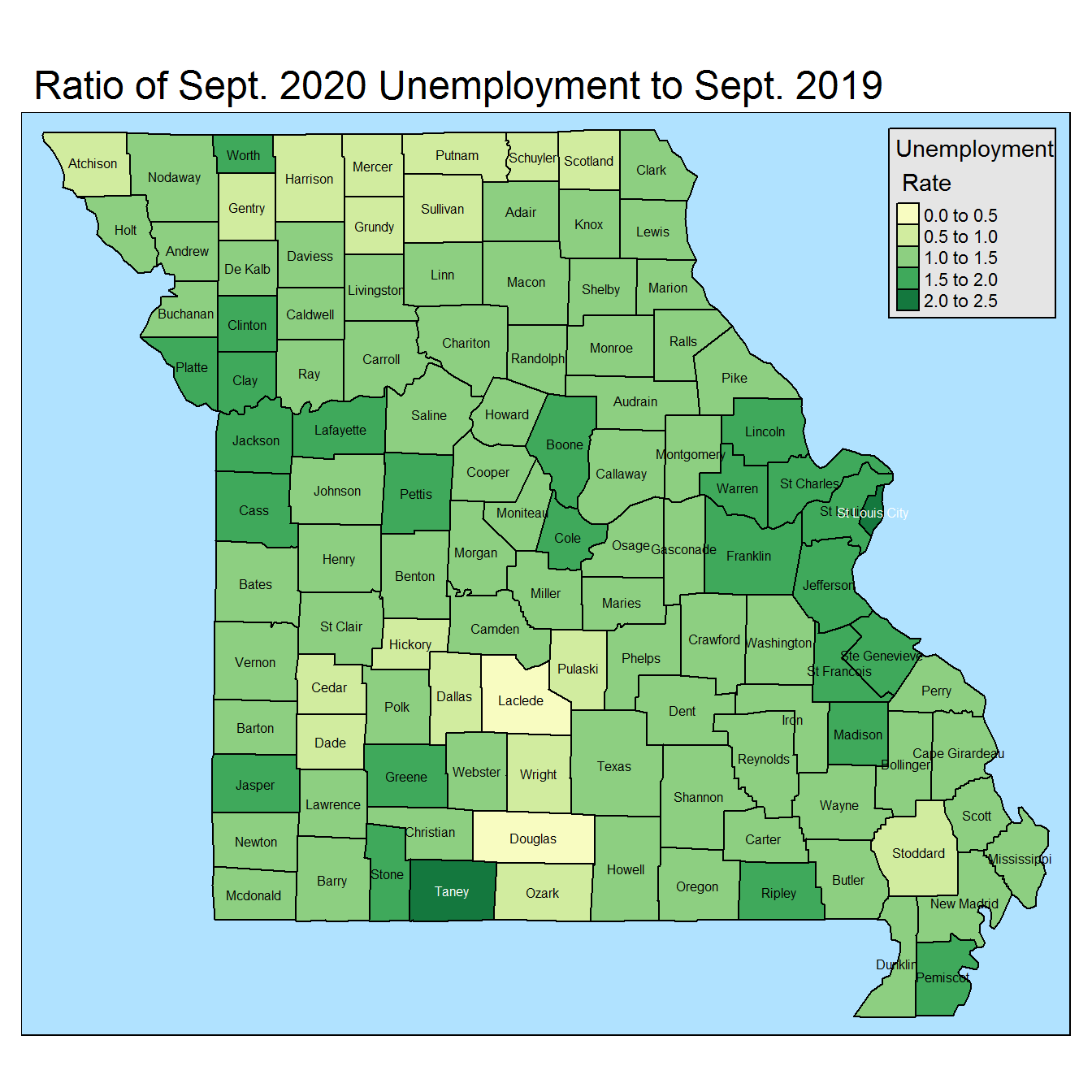
Focusing on the final choropleth we see that most counties appear in the 1.0 to 1.5 range representing a slight increase in unemployment since the previous year. We also see clusters of higher unemployment rates, over the previous year, around Kansas City and St. Louis. Finally, we note that Taney county (home to Branson) and St. Louis city have the highest increase in unemployment since the previous year.