Introduction
For this project we will continue to work with the weather data available from Kaggle at https://www.kaggle.com/selfishgene/historical-hourly-weather-data. Our goal is to forecast the temperature in Kelvin (K) one week ahead with hourly data and consider the affects of humidity and atmospheric pressure (hPa) on our model.
To achieve our goal we begin with data visualization to examine the data and the relationship between the variables. After this we create multiple functions to assist in forecasting and error estimation. We then compare some of the best models when it comes to minimizing error. We conclude with a discussion of our results and methods as well as considering future strategies for forecasting this type of data.
Section 1: Data Exploration
In this section we explore our datasets. We begin by loading the datasets for temperature, humidity and atmospheric pressure. As we did in the previous project we will only work with the Saint Louis data. Our data cleaning steps are shown below.
# datasets folder location
datafolder <- here::here("csv", "kaggle_2020_july_project")
# loads datasets
myfiles <- paste(datafolder, list.files(path=datafolder), sep='/') %>%
    lapply(read.csv)
# names datasets
names(myfiles) <- list.files(path=datafolder) %>%
    tools::file_path_sans_ext()

# create datetime index which includes hourly data
for (name in names(myfiles)) {
    myfiles[[name]]$datetime %<>%
        strptime("%Y-%m-%d %H:%M:%S") %>%
        as.POSIXct()
}

# subset data to just Saint Louis and create xts
for (name in names(myfiles)) {
    myfiles[[name]] %<>%
        select(Saint.Louis, datetime) %>%
        na.omit() %$% # %$% gives xts() hidden data argument
        xts(x=Saint.Louis, order.by=datetime)
}
Our focus for this project will be the hourly data from the beginning of October 2017 till the end of our dataset in late November 2017. We plot the hourly graphs for this period for each of our datasets below.
# plot data oct to nov 2017
myfiles[["humidity"]]["2017-10/2017-11"] %>%
    plot.xts(main="Saint Louis hourly humidity")
myfiles[["pressure"]]["2017-10/2017-11"] %>%
    plot.xts(main="Saint Louis hourly atmospheric pressure (hPa)")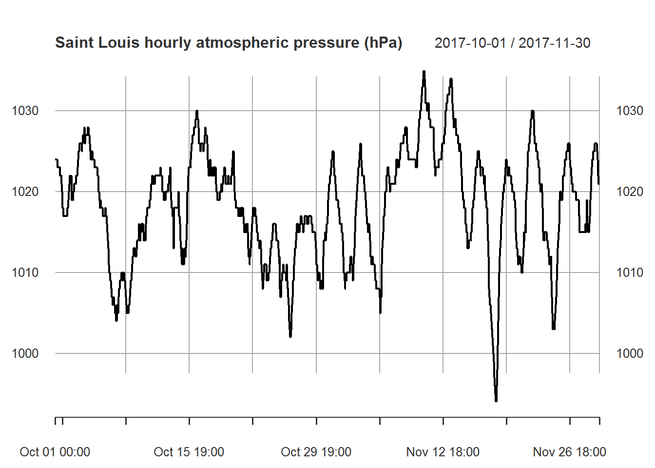
myfiles[["temperature"]]["2017-10/2017-11"] %>%
    plot.xts(main="Saint Louis hourly temperature (K)")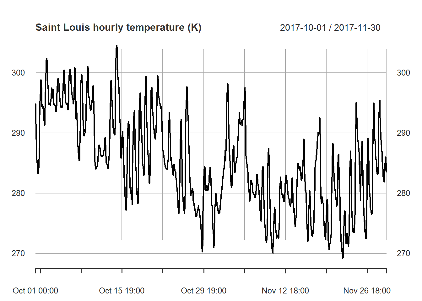
Before we decide to use the humidity or atmospheric pressure in our forecast model we want to check to see if there is reasonable correlation. To evaluate our forecasts we will use the last week for our testing set. So we only consider the correlation between the data in October and November without the most recent week.
merge(humidity=myfiles[["humidity"]]["2017-10/2017-11"],
      pressure=myfiles[["pressure"]]["2017-10/2017-11"],
      temperature=myfiles[["temperature"]]["2017-10/2017-11"]) %>%
    head(n=-24*7) %>%  # removes the most recent week from dataset
    cor() %>%
    corrplot(method = "number", type = "upper", bg= "#838495",
             tl.col = 'black', tl.srt = 35, cl.align.text = 'l')
Based on the above correlation chart it appears that temperature and pressure are moderately correlated while temperature and humidity are uncorrelated. Based on this result we will not use humidity when building our models. Note that we could also attempt to determine correlation over time. This would help us understand if the low correlation with humidity is normal. The same could be done with atmospheric pressure. In this case we will keep things simple and move onto the next part of our analysis.
Section 2: Functions and Forecasting Part 1
Now that we have finished our initial data exploration we move towards forecasting. While we could try to take a single forecast and leave things at that we decided to make multiple forecast and try to determine which one gives us the best result. To do this all of our models are fitted on the October and November 2017 data without the last week. The last week is used exclusively as a testing set. Once we have our forecast we then use our testing set against our forecasted values to calculate Mean Absolute Error (MAE), Root Mean Square Error (RMSE) and Mean Absolute Percentage Error (MAPE).
To assist in forecasting we create customized functions to calculate error and forecast with different settings. We give brief descriptions of the functions in this section and the functions themselves have additional comments to help explain their usage. While these functions are somewhat flexible they are designed specifically for this project and the datasets we are using.
Our first function forecast_errors is designed to return the MAE, RMSE and MAPE when given the testing set along with the forecasted values (specifically the mean of the forecasted values). This function will be used extensively in our analysis.
forecast_errors <- function(obs, fc) {
    # computes MAE, RMSE and MAPE as a row matrix
    # takes as inputs obs and fc
    # obs: true observations of values being forecasted
    # fc: forecasted values of true observations
    errors <- matrix(0L, nrow=1, ncol=3)
    errors[1, 1] <- mean(abs(obs - fc)) # MAE
    errors[1, 2] <- sqrt(mean((obs - fc)^2)) # RMSE
    errors[1, 3] <- mean(abs(obs - fc) / obs) #MAPE
    colnames(errors) <- c("MAE", "RMSE", "MAPE")
    return(errors)
}
The next function forecast_function uses hourly data to forecast one week into the future by splitting the data and holding out the most recent week of data for a testing set. The forecast is done by taking a number of Fourier pairs and then using auto.arima to forecast the result. We then are left with a list of output containing the training set, the testing set, the model fit, the forecast and the errors. The errors being computed with the help of our forecast_errors function. Note that the forecast from this function does not utilize atmospheric pressure. We will create another function later on for that purpose.
forecast_function <- function(data, k) {
    # forecast hourly data by splitting data into train
    # and test sets with test set containing the most
    # recent week of data model then makes a one week
    # ahead forecast and computes error estimates
    # errors include MAE, RMSE, and MAPE

    # model output is a list containing:
    # training set, testing set, model fit, forecast and errors

    # takes as input "data" and "k"
    # data: time series to be split and forecasted
    # k: number of Fourier pairs
    train <- data[1:(length(data)-24*7), ] %>%
        ts(frequency=24)
    test <- data[(length(data)-24*7+1):length(data), ] %>%
        ts(start=end(train)+c(0,1), frequency=24)

    harmonics <- train %>% fourier(K=k)
    fit <- train %>% auto.arima(xreg=harmonics, seasonal=FALSE)
    harmonics <- train %>% fourier(K=k, h=length(test))
    fc <- fit %>% forecast(xreg=harmonics)

    errors <- forecast_errors(test, fc$mean)

    return(list(train, test, fit, fc, errors))
}
This next function efl simply extracts the nth element from a list. Since we are using piping %>% and some of our results are contained in a list, this function helps make the piping process work smoothly.
efl <- function(mylist, n) {
    # helper function efl (extract from list)
    # extracts the "n"th list item from a list "mylist"
    return(mylist[[n]])
}
The create_error_matrix function is designed specifically to create a matrix with rows of error terms based on the number of Fourier pairs. Since our data is hourly with frequency 24 we can have at most 12 Fourier pairs. This function allows us to look at all possible Fourier pairs and see which model gives us the best forecast based on our the results of forecast_function.
create_error_matrix <- function(data) {
    # creates a matrix of error terms MAE, RMSE and MAPE
    # when using forecast function for k=1 to k=12 Fourier pairs
    error_matrix <- matrix(0L, nrow=12, ncol=3)
    for (k in 1:12) {
      error_matrix[k, ] <- data %>%
          forecast_function(k=k) %>%
          efl(5)
    }
    colnames(error_matrix) <- c("MAE", "RMSE", "MAPE")
    rownames(error_matrix) <- c("k=1", "k=2", "k=3", "k=4",
                                "k=5", "k=6", "k=7", "k=8",
                                "k=9", "k=10", "k=11", "k=12")
    return(error_matrix)
}
Now that we have a few useful functions we take a look at our predictions accuracy on the data using create_error_matrix.
myfiles[["temperature"]]["2017-10/2017-11"] %>%
    create_error_matrix()
## MAE RMSE MAPE
## k=1 12.709935 13.770362 0.04457202
## k=2 12.007554 13.071131 0.04209799
## k=3 12.095065 13.152471 0.04240757
## k=4 11.878011 12.946158 0.04164091
## k=5 11.774873 12.850944 0.04127603
## k=6 11.827466 12.899132 0.04146215
## k=7 11.719243 12.800030 0.04107912
## k=8 6.326093 7.699797 0.02205791
## k=9 11.770596 12.847119 0.04126085
## k=10 11.799693 12.873809 0.04136383
## k=11 11.807686 12.881291 0.04139207
## k=12 11.778094 12.853325 0.04128754These results are rather interesting since the prediction errors are similar in all cases except for having 8 Fourier pairs which does a significantly better job forecasting. This is a good opportunity to examine the forecast visually which we do below. We will compare forecasts using 8 and then 6 Fourier pairs.
myfiles[["temperature"]]["2017-10/2017-11"] %>%
    forecast_function(k=8) %>%
    efl(4) %>%
    autoplot()
myfiles[["temperature"]]["2017-10/2017-11"] %>%
    forecast_function(k=6) %>%
    efl(4) %>%
    autoplot()
The first plot corresponding to 8 Fourier pairs has a forecast with larger amplitude. It also appears to have smaller prediction intervals as well as having a higher mean value which makes it align closer to the rest of the historical data. The second plot corresponding to 6 Fourier pairs seems the opposite. It has smaller amplitude, larger prediction intervals and a mean which more closely resembles the most recent observations.
With the first plot having the model with ARIMA(5,1,1) as opposed to ARIMA(5,1,0), the MA term may be playing a significant role in the difference, but since we are also using Fourier pairs it is not clear. We will not examine this in detail, but looking more closely at moving average (MA) terms versus autoregressive (AR) terms could be useful. What we will say is that graphically the difference was clear. So visually checking a forecast, when possible, is probably a good idea. Especially if we do not have access to data to calculate error estimates.
Section 3: Functions and Forecasting Part 2
We now want to create a more sophisticated model which utilizes atmospheric pressure. Our first goal is to create a forecast of atmospheric pressure independent of temperature. This is done by splitting the atmospheric pressure into a training and testing set. The testing set being the most recent week of our data and not utilized in our model. We use the atmospheric pressure training set to fit our temperature model and use the atmospheric pressure forecast to help forecast temperature data.
Since we are working with hourly data with a frequency of 24, both the forecast for atmospheric pressure and temperature will have 12 Fourier pairs each. We will consider each combination of pairs for a total of 144 forecasts.
To accomplish this goal we will need modified versions of our previously designed functions to forecast our data quickly and in a tidy manner. To this end we create more functions. Our first new function is called dynamic_ffl. This function utilizes some of our previous functions to take as input the temperature and atmospheric pressure datasets along with the corresponding number of Fourier pairs to be used in the model. The output is a list containing the training and testing set for temperature, the model fit and forecast, and finally the errors for our model.
dynamic_ffl <- function(data, var1, k, k1) {
    # similar to forecast_function with additional required
    # inputs var1 and k1
    # this function allows user to forecast the main series data
    # by splitting a time series var1 with the same times into a
    # a training set and a forecast set
    # we then use this information to create a model with var1 as
    # time series regression components for data
    # the input k1 refers to the number of Fourier pairs
    # used when forecasting var1

    train <- data[1:(length(data)-24*7), ] %>%
        ts(frequency=24)
    test <- data[(length(data)-24*7+1):length(data), ] %>%
        ts(start=end(train)+c(0,1), frequency=24)

    # forecast for regression variables
    fc1 <- forecast_function(var1, k=k1)

    harmonics <- train %>% fourier(K=k)
    fit <- train %>% auto.arima(xreg=cbind(harmonics, a=fc1[[1]]),
                                seasonal=FALSE)
    harmonics <- train %>% fourier(K=k, h=length(test))
    fc <- fit %>% forecast(xreg=cbind(harmonics, a=fc1[[4]]$mean))

    errors <- forecast_errors(test, fc$mean)

    return(list(train, test, fit, fc, errors))
}
The next function dynamic_ffl_errors allows us to see the forecast errors for each combination of Fourier pairs used with atmospheric pressure given a fixed number of Fourier pairs for the temperature.
dynamic_ffl_errors <- function(data, var1, k) {
    # creates a matrix of error terms MAE, RMSE and MAPE
    # when using forecast function for k1=1 to k1=12 Fourier pairs
    # in the regression variable series and fixed k for the number
    # of Fourier pairs in the main series
    error_matrix <- matrix(0L, nrow=12, ncol=3)
    for (k1 in 1:12) {
      error_matrix[k1, ] <- data %>%
          dynamic_ffl(var1=var1, k=k, k1=k1) %>%
          efl(5)
    }
    colnames(error_matrix) <- c("MAE", "RMSE", "MAPE")
    rownames(error_matrix) <- c("k1=1", "k1=2", "k1=3", "k1=4",
                                "k1=5", "k1=6", "k1=7", "k1=8",
                                "k1=9", "k1=10", "k1=11", "k1=12")
    return(error_matrix)
}
The function f is a helper function which puts the data we need into dynamic_ffl_errors so we only need the number of Fourier pairs for temperature.
f = function(x) {
    # helper function calls dynamic_ffl_errors for a fixed number
    # of Fourier pairs x
    dynamic_ffl_errors(data=myfiles[["temperature"]]["2017-10/2017-11"],
                       var1=myfiles[["pressure"]]["2017-10/2017-11"], k=x)
}
Using the function f above we can easily utilize lapply to loop over all Fourier pairs for temperature. This block will take a while to run when first generating the 144 error rows we are interested in. So we save the data for future usage. Additionally, we include a commented out block for displaying the error tables numerically.
# load data or create data
if (!file.exists(here::here("csv",
                            "kaggle_2020_july_project_temp_files",
                            "myforecast.RData")))
{
    myforecast <- lapply(1:12, f)

    save(myforecast, file = here::here("csv",
                                       "kaggle_2020_july_project_temp_files",
                                       "myforecast.RData"))
} else {
    load(here::here("csv",
                    "kaggle_2020_july_project_temp_files",
                    "myforecast.RData"))
}

# Extra unused code to plot tables directly:
# for (k in 1:12) {print(myforecast[[k]])}
Utilizing the output from the above block we clean up the data a bit and create a useful visualization of our error terms.
# block to visualize error estimates
long_form = data.frame() # initialize empty dataframe

for (myindex in 1:12) {
    long_form <- myforecast[[myindex]] %>%
        melt(id.vars=c("MAE", "RMSE", "MAPE")) %>%
        cbind(rep(paste("k" ,myindex, sep="="), 12*3)) %>%
        rbind(long_form)
}

col_name <- "harm_pairs_temp"
colnames(long_form)[4] = col_name
long_form$harm_pairs_temp <- factor(long_form$harm_pairs_temp,
                                    levels=c("k=1", "k=2", "k=3", "k=4",
                                             "k=5", "k=6", "k=7", "k=8",
                                             "k=9", "k=10", "k=11", "k=12"))

ggplot(long_form, aes(value, harm_pairs_temp, col=Var1)) +
    geom_jitter() +
    facet_grid(.~Var2, scales="free") +
    scale_y_discrete(name="Fourier Pairs for Temperature",
                     limits=rev(levels(long_form$harm_pairs_temp))) +
    ggtitle("Forecast Error by Fourier Pairs") + xlab("Error Value") +
    labs(color = "Fourier pairs\n Pressure")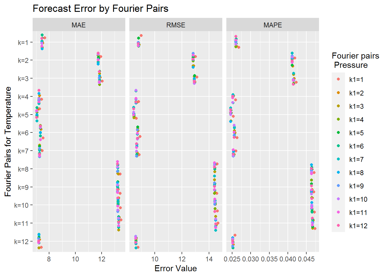
We can see from the graph above that the Fourier pairs for atmospheric pressure seem to have very little impact on the forecast error. Though it seems that having a single Fourier pair for atmospheric pressure is generally the worst option. Still the values tend to be very close together. On the other hand we have significant changes based on the number of Fourier pairs associated to temperature. We can see roughly three different types of accuracy levels. The most accurate predictions seem to correspond to 1, 4, 5, 6, 7, and 12 Fourier pairs for temperature. Since 5 Fourier pairs for temperature appears to corresponds to the lowest forecast errors we include its error table below.
myforecast[[5]]## MAE RMSE MAPE
## k1=1 7.258639 8.626725 0.02533320
## k1=2 7.104247 8.482714 0.02478932
## k1=3 7.061803 8.445536 0.02463932
## k1=4 7.059139 8.443063 0.02462993
## k1=5 7.063582 8.447114 0.02464560
## k1=6 7.063537 8.447046 0.02464545
## k1=7 7.054475 8.438873 0.02461347
## k1=8 7.056193 8.440423 0.02461953
## k1=9 7.048961 8.433828 0.02459403
## k1=10 7.046538 8.431599 0.02458548
## k1=11 7.048938 8.433752 0.02459395
## k1=12 7.047378 8.432313 0.02458845Based on this chart our forecast is not quite as good as our earlier forecast without atmospheric pressure. Moreover, and more perplexing, is that having 8 Fourier pairs for temperature when utilizing atmospheric pressure is not one of the better models.
Section 4: Examing Forecasts
In this section we will take a closer look at 3 different models. We look at our best model with 8 Fourier pairs for temperature and no terms for atmospheric pressure, our second best model with 5 Fourier pairs for temperature and 10 Fourier pairs for atmospheric pressure and one of our worse models with 8 Fourier pairs for temperature and 10 Fourier pairs for atmospheric pressure.
best_model <- myfiles[["temperature"]]["2017-10/2017-11"] %>%
    forecast_function(k=8)
second_best_model <- myfiles[["temperature"]]["2017-10/2017-11"] %>%
    dynamic_ffl(myfiles[["pressure"]]["2017-10/2017-11"], k=5, k1=10)
bad_model <- myfiles[["temperature"]]["2017-10/2017-11"] %>%
    dynamic_ffl(myfiles[["pressure"]]["2017-10/2017-11"], k=8, k1=10)
Now that we have computed our models we plot them below in the order they were described.
best_model %>% efl(4) %>% autoplot()
second_best_model %>% efl(4) %>% autoplot()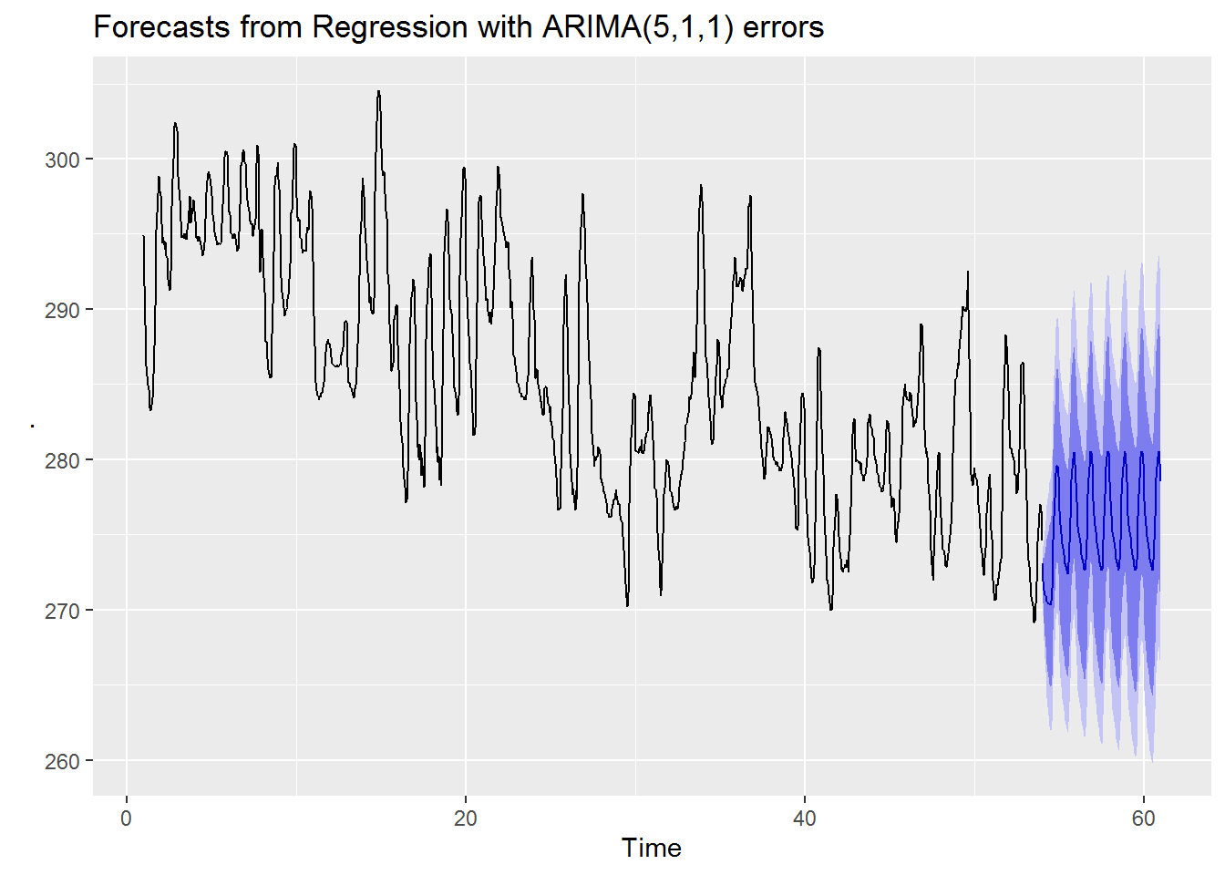
bad_model %>% efl(4) %>% autoplot()
From visual inspection we can see that both our best and second best models have very similar forecasts. Visually it seems that our best model has slightly higher average forecast values with a possibly larger amplitude. On the other hand for our worse model we see a forecast which has a decreasing trend and smaller amplitude.
Perhaps the most striking contrast between the good forecast models and the bad forecast model is that both good forecast models have much smaller prediction intervals while the worse model has a much wider interval. This seems to indicate that the better models are not just predicting the values more accurately they are also more confident in their predictions.
We now take a closer look at our best model’s forecast when compared to the actual data
suppressWarnings(suppressMessages(print(
    autoplot(best_model[[4]]) +
        autolayer(best_model[[2]], series = "Data") +
        autolayer(best_model[[4]]$mean, series = "Forecast") +
        guides(colour=guide_legend(title="Data series")) +
        xlab("Day beginning October 1, 2017") +
        ylab("Temperature in Kelvin") + xlim(c(40,61))
)))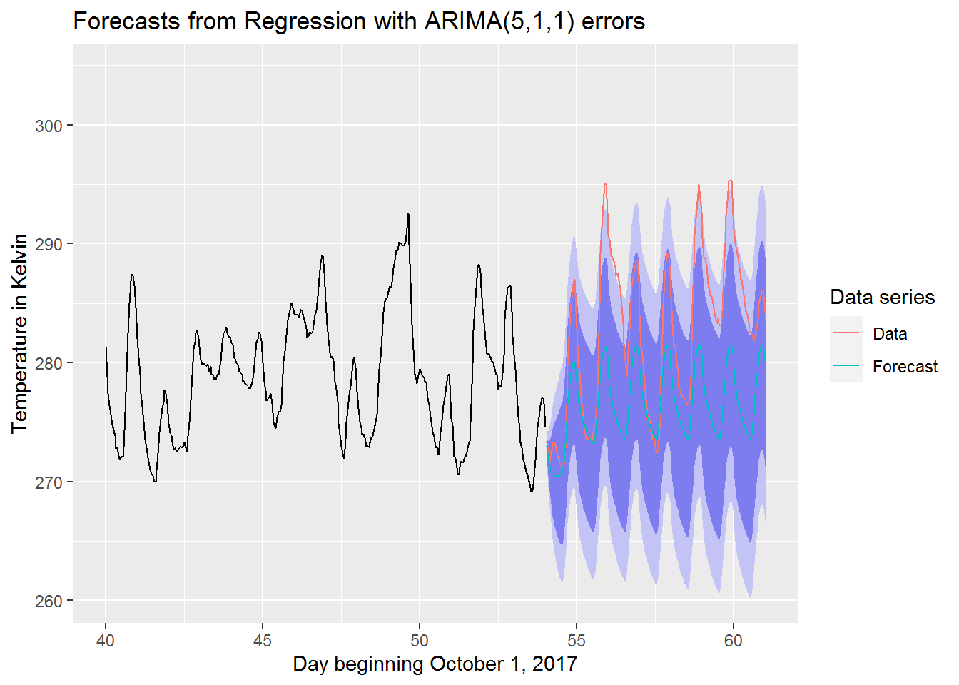
We can see that the actual data tends to be above the forecasted values. Most of the actual data still manages to stay within the 95% prediction interval though. This is pretty good considering that the actual data seems to have been unexpectedly warm during this period.
Conclusion
As we have seen our best model ended up not utilizing the atmospheric pressure data. Now, while this model did have the lowest error it was not significantly better than our other good models utilizing atmospheric pressure. Another point to consider is that for our models without atmospheric pressure only 1 of the 12 had a relatively good forecast whereas 50% of our models with atmospheric pressure were nearly as good. From the perspective of consistency it does appear that we are more likely to get a decent forecast when utilizing atmospheric pressure in our model.
On the topic of consistency in model accuracy we should still be concerned with our results. What if we forecast another week ahead? Will we still see the same model accuracy that we saw before? Based on how easily these models seem to change from a decent to a not very good forecast we should be worried. One solution might be to test our models over time and try to forecast our errors. In this manner we could see if any of our models are more stable in their forecast accuracy. Another idea would be to try to fine tune our ARIMA settings instead of relying on auto.arima. Additionally, we could consider entirely different models or look at model selection criteria to help make our decisions. These are all things that we can consider for future projects.
The biggest thing which stood out to me is how valuable looking at the forecast graphs was. We were able to see how confident our models were by looking at the prediction intervals. Moreover, we could see from the worse model forecast that we plotted that the amplitude for the day and night cycle was too closely related to the most recent data and did not reflect the general temperature trend. Thus we end this project by saying, regardless of the method, it is always valuable to visualize the results to ensure the model is working as intended.