Introduction
Hello and welcome to another post on statistical programming with R. This post will be about kriging. Kriging is a type of interpolation used on point-referenced spatial data. To begin, we use the geoR package to get access to the ca20 dataset. Below we look at the class and summary of the dataset.
data(ca20) # makes ca20 data accessable in R environment
class(ca20)
## [1] "geodata"summary(ca20)## Number of data points: 178
##
## Coordinates summary
## east north
## min 4957 4829
## max 5961 5720
##
## Distance summary
## min max
## 43.01163 1138.11774
##
## Borders summary
## east north
## min 4920 4800
## max 5990 5800
##
## Data summary
## Min. 1st Qu. Median Mean 3rd Qu. Max.
## 21.00000 43.00000 50.50000 50.67978 58.00000 78.00000
##
## Covariates summary
## altitude area
## Min. :3.300 1: 13
## 1st Qu.:5.200 2: 49
## Median :5.650 3:116
## Mean :5.524
## 3rd Qu.:6.000
## Max. :6.600
##
## Other elements in the geodata object
## [1] "reg1" "reg2" "reg3"We see that the ca20 dataset has class geodata along with 178 data points; we also have other descriptive statistics. For a more detailed description of the dataset we can type help(ca20) into the console. For our post, we highlight that the point-referenced data in ca20 has a response variable recording the calcium content in the soil. The data also includes information on altitude as well as well as information about which sub area the data comes from. We will only be focusing on the calcium content in this post, but note that improved kriging performance could be gained by using the additional information. Now, we do not need to use the geodata class and so we transform our dataset into a data frame.
# put data into a dataframe for easy use
calcium_original <-data.frame(cbind(ca20$coords, data = ca20$data, ca20$covariate))
Checking Conditions for Kriging
Before we begin kriging we will check for normality, stationarity, and lack of trend in the data. We first check for normality. We do this by ignoring the spatial data and plotting a histogram and Q-Q plot.
## check for normality

# histogram
ggplot(data = calcium_original, aes(data)) +
  geom_histogram(aes(y = stat(density)), bins = 30) +
  stat_function(
    fun = dnorm,
    args = list(mean = mean(calcium_original$data), sd = sd(calcium_original$data)),
    lwd = 1.5,
    aes(col = "Normal Density")
  ) +
  scale_color_manual("Legend", values = "red") +
  ggtitle("Histogram of Data") +
  xlab("Calcium Content") + ylab("Density")
# Q-Q plot
qqnorm(calcium_original$data, col = 'red')
qqline(calcium_original$data)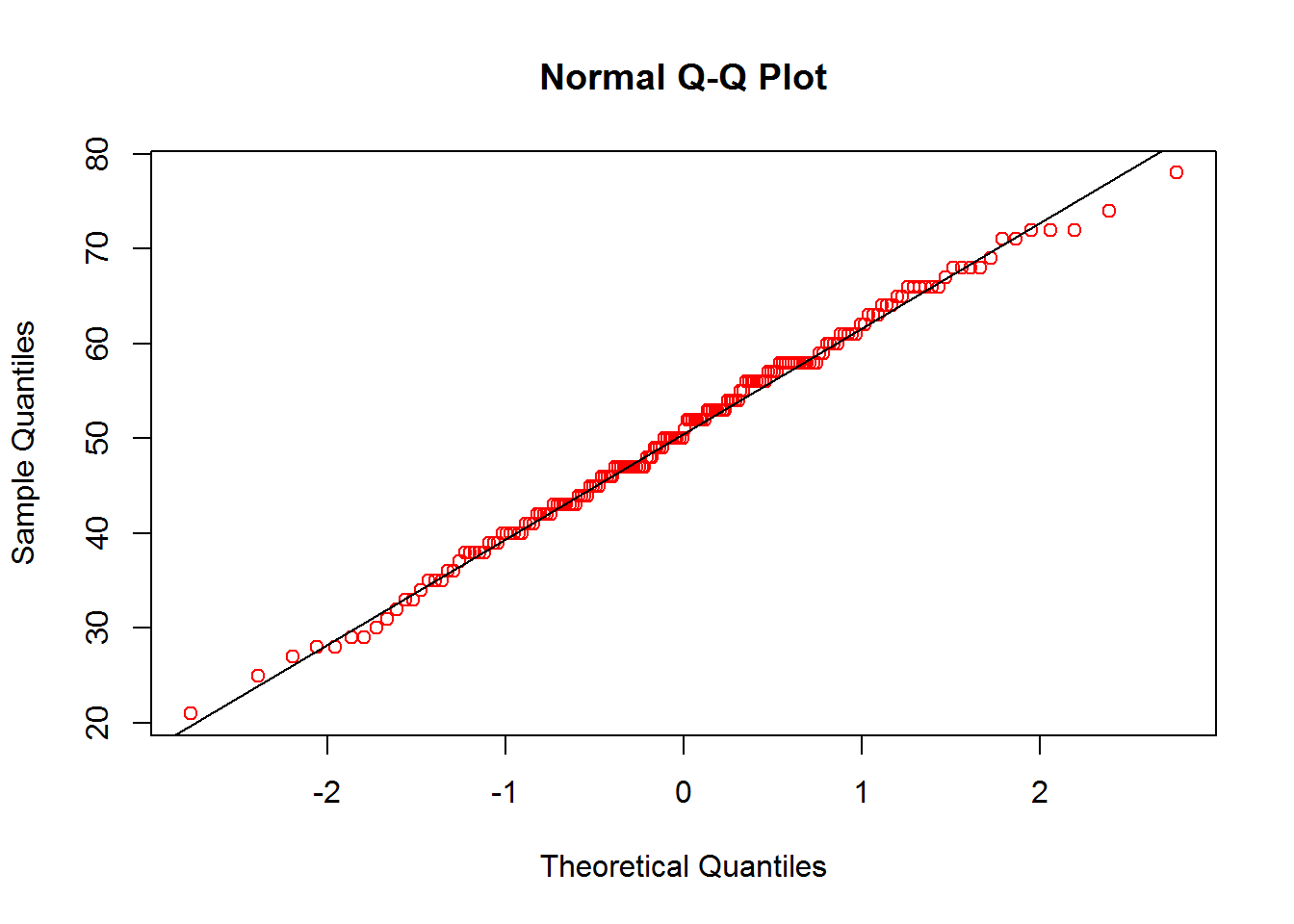
Based on the histogram and Q-Q plot, it seems that the data roughly follows a normal distribution. Now that we have confirmed normality, we want to check for stationarity. We do this using a graphical approach. We first plot the points to inform the reader of their locations. We next plot a contour plot with slight smoothing. This indicates that we have stationarity due to nearby points having similar values. As the smoothing may not be trusted, we also include a plot of the points with a color gradient so that we can visually compare each point to its neighbor.
## check for spatial stationarity

# plot of point-referenced data locations
coords <- as.matrix(calcium_original[,c("east", "north")])
plot(coords, pch=20, col = "darkgrey", xlab = "Easting (m)",
     ylab = "Northing (m)", main = "Location of Sample Data")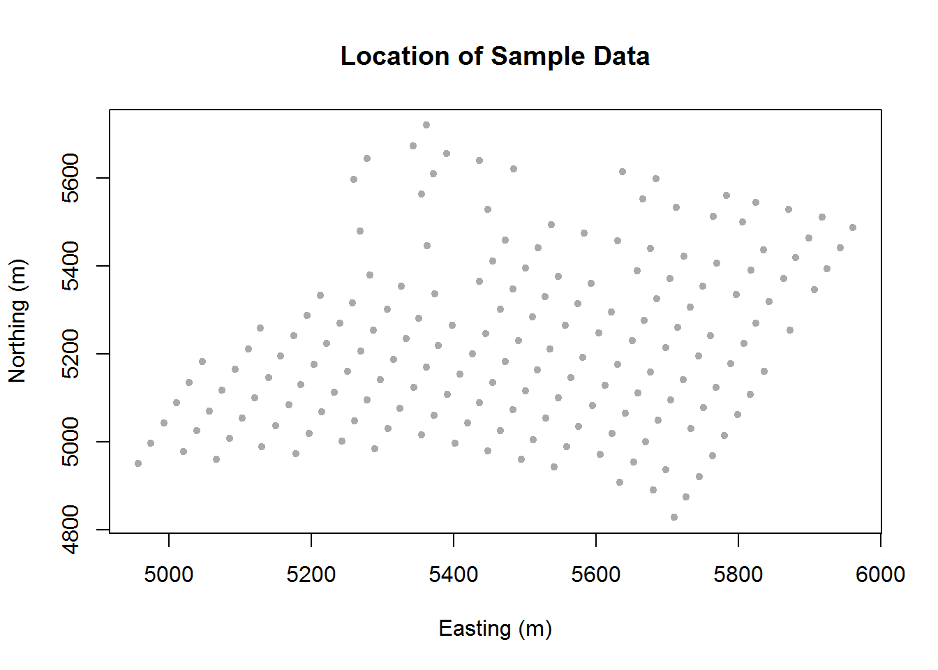
# contour plot of calcium levels
col.br <- colorRampPalette(c("blue", "cyan", "yellow", "red"))
surf <- mba.surf(cbind(coords, calcium_original[,"data"]), no.X = 100, no.Y = 100,
                 h = 4, m = 2, extend = FALSE)$xyz.est
image.plot(surf, xaxs = "r", yaxs = "r", xlab = "Easting (m)",
           ylab = "Northing (m)", col = col.br(25), main = "Contour Plot")
contour(surf, add=T)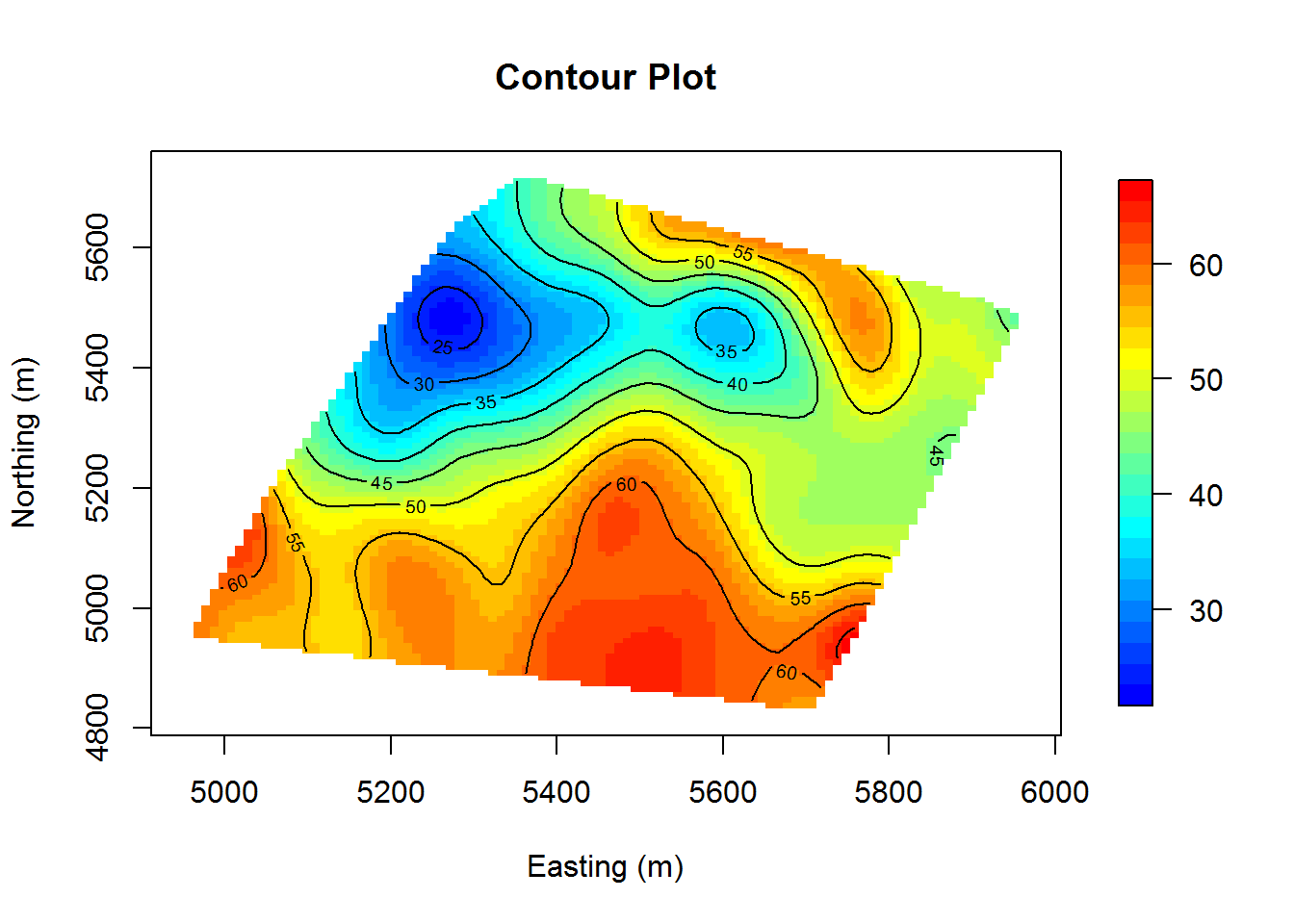
# plot of points with color gradient
myPalette <- colorRampPalette(c("blue", "cyan", "yellow", "red"))
sc <- scale_colour_gradientn(colours = myPalette(100))
ggplot(data = calcium_original, aes(x = east, y = north, colour = data)) +
  geom_point(size = 4) + sc + xlab("Easting (m)") + ylab("Northing (m)") +
  ggtitle("Calcium Content Color Gradient") + labs(col = c("Calcium \nContent")) +
  theme_bw()
While we can see some randomness, there tends to be a reasonable amount of similarity between neighboring points. We conclude that we have sufficient stationarity.
Now that we have checked for stationarity, we would like to check for trends in the data. Ideally we will find no trends and then we can safely move to the next step. Once again we will rely on graphical analysis. Below are graphs of the Easting and Northing data plotted against the calcium content. We use ggplot and the geom_smooth function to visualize any trends.
ggplot(data = calcium_original, aes(x = east, y = data)) +
  geom_point() + geom_smooth(method = "loess") +
  xlab("Easting (m)") + ylab("Calcium Content") + ggtitle("Easting Trend")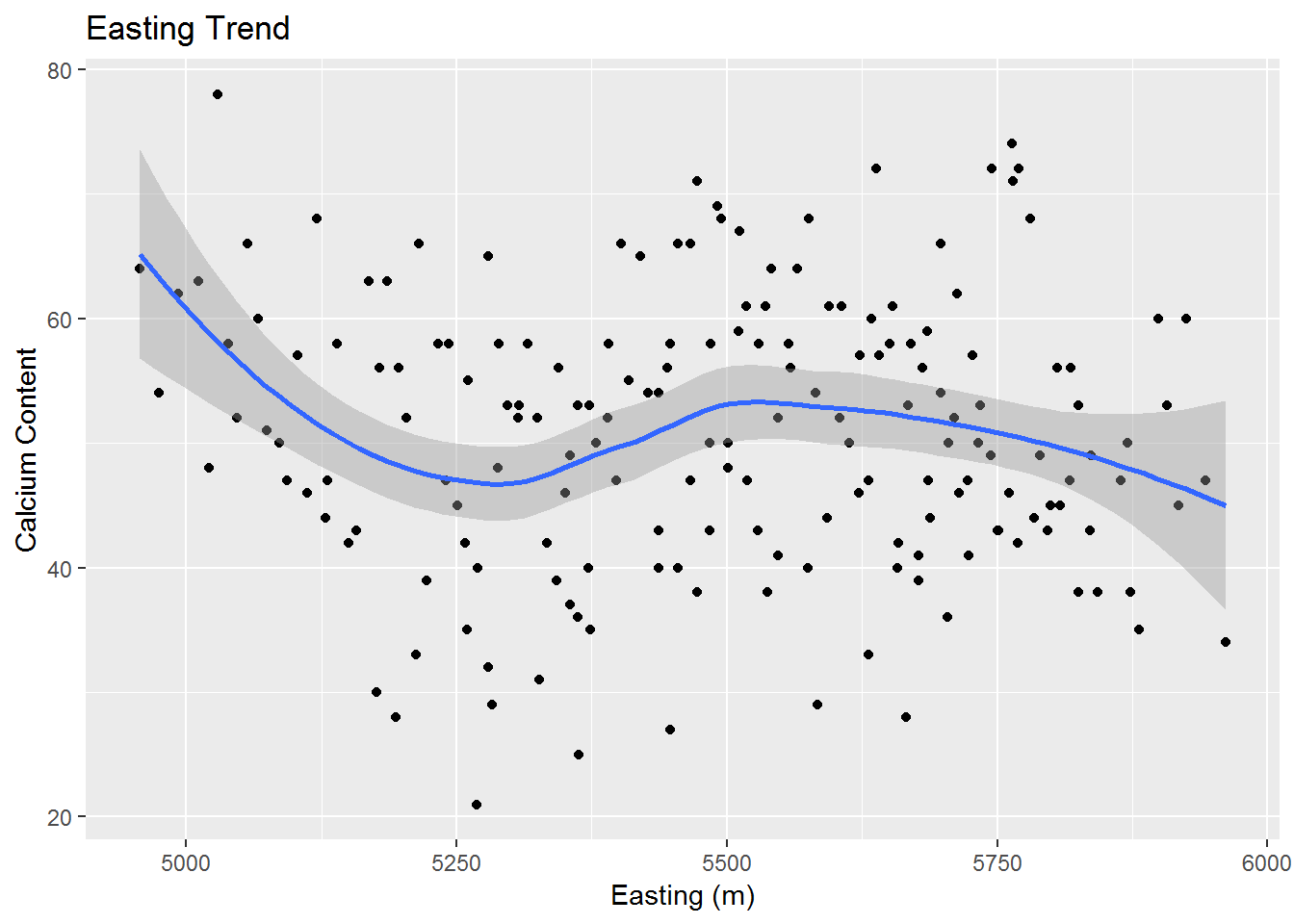
ggplot(data = calcium_original, aes(x = north, y = data)) +
  geom_point() + geom_smooth(method = "loess") +
  xlab("Northing (m)") + ylab("Calcium Content") + ggtitle("Northing Trend")
We do find some minor trends, however, most of the points seem to be fairly scattered about and not too close to their associated trend curve. So we may assume that we do not have a sufficient trend for either our Easting or Northing directions.
Variograms and Kriging
Now that we have checked the relevant conditions of normality, stationarity, and lack of trend; we change our focus to creating variograms and performing kriging. Below, we have a variogram of our data along with the nugget, sill and range. Note that our variogram is fit to an exponential model.
coords <- as.matrix(calcium_original[,c("east", "north")])
max.dist <- 0.25 * max(iDist(coords)) # requires spBayes package and computes inter-site distance
bins <-80 # seems to group observations into a number of groups

# from geoR: use variog to compute variogram and variofit to fit variogram models
vario.calcium_original <- variog(coords = coords, data = calcium_original$data,
                        uvec = (seq(0, max.dist, length = bins))) # variog from geoR
## variog: computing omnidirectional variogramfit.calcium_original <- variofit(vario.calcium_original, ini.cov.pars = c(100, 200/-log(0.05)),
cov.model = "exponential", minimisation.function = "optim", fix.nugget = T,
weights = "equal")## variofit: covariance model used is exponential
## variofit: weights used: equal
## variofit: minimisation function used: optimplot(vario.calcium_original, ylim = c(0, 250), xlim = c(0, 300),
main = "Variogram with Exponential Fit",
xlab = "Distance (m)", ylab = "Semivariance")
lines(fit.calcium_original)
abline(h = fit.calcium_original$nugget, col = "blue", lty=2)
abline(h = fit.calcium_original$cov.pars[1] +fit.calcium_original$nugget, col = "green", lty=1)
abline(v = -log(0.05) * fit.calcium_original$cov.pars[2], col = "red3", lty=3)
legend(0, 250, legend=c("Nugget", "Sill", "Range"),
col=c("blue", "green", "red"), lty = c(2,1,3), cex=0.8)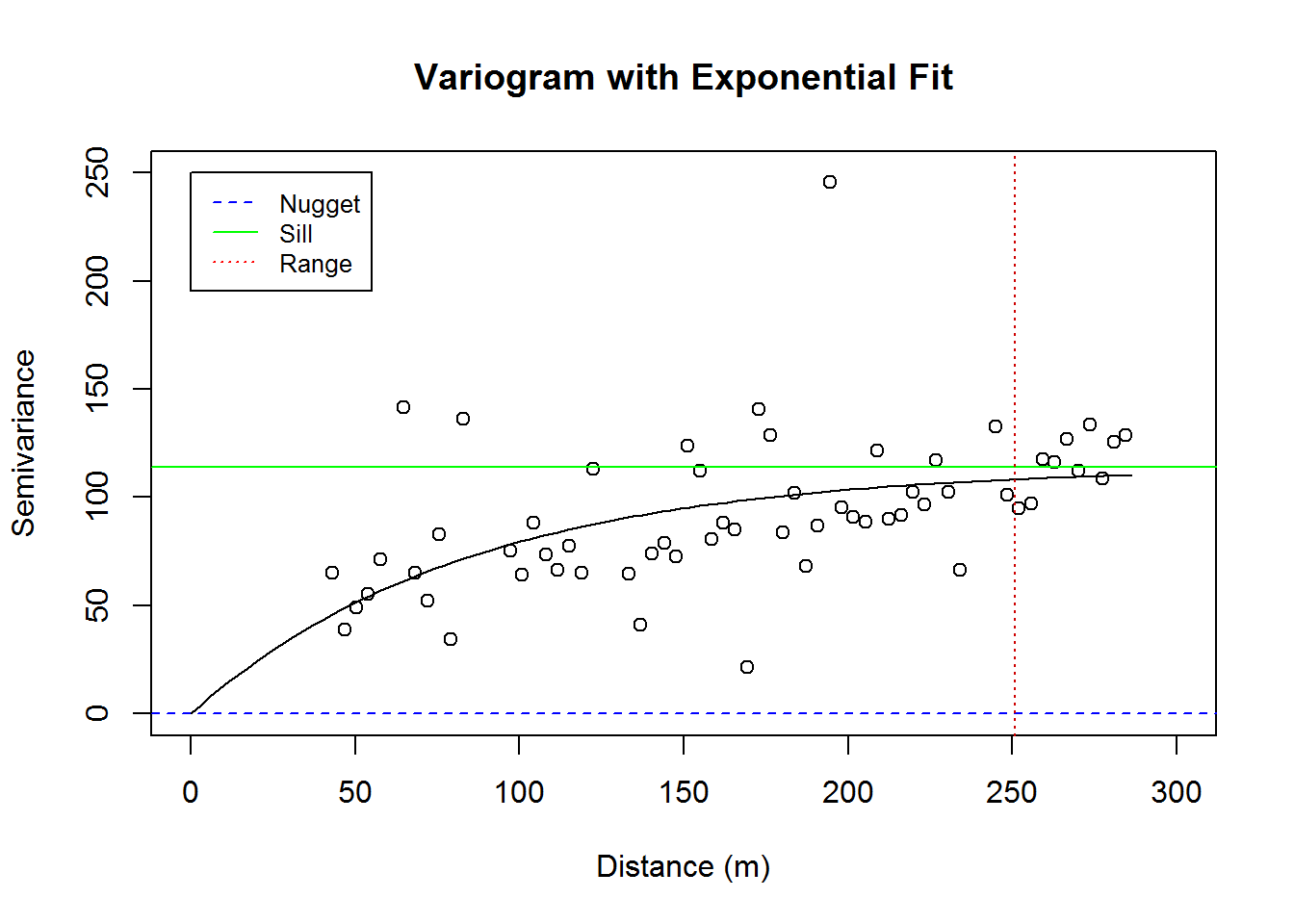
We would like to begin kriging, but rather than use the geoR package for kriging we will use the gstat package. So, while we have a very nice variogram from using the geoR package, let’s do a simpler variogram using the gstat package. Using the gstat package we get an exponentially fit variogram; which we include below.
# convert calcium_original to type SPDF
calcium_temp <- calcium_original
sp::coordinates(calcium_temp) <- ~ east + north

# variogram
cal.vgm <- variogram(data~1, calcium_temp)
cal.fit <-fit.variogram(cal.vgm, model = vgm(psil=125, model="Exp", range=400, nugget =50))
plot(cal.vgm, cal.fit, xlab = "Distance (m)", ylab = "Semivariance",
     main = "Variogram with Exponential Fit")
Before we do a kriging with a full grid of points we will split the data frame into two parts. This will be done to gauge our model’s accuracy. We split half of the data into a training set and half of the data into a testing set. The training set will be used for model building and the testing set will be used for kriging. We convert our training and testing sets into a SpatialPointsDataFrame; that is a data frame of class SPDF. We create a quick variogram with our training set and then perform kriging on our testing set.
## kriging

cal.df <- calcium_original
set.seed(1337)
cal.sample <- sample(1:nrow(cal.df), size = nrow(cal.df)/2)
cal.train <- cal.df[cal.sample, ] # used for training model
cal.test <- cal.df[-cal.sample, ] #used for testing model

# convert train and test data frames to SPDF
coordinates(cal.train)  <- ~ east + north
coordinates(cal.test)  <- ~ east + north

# variogram for fitted data
cal.train.vgm <- variogram(data~1, cal.train)
cal.train.fit <-fit.variogram(cal.train.vgm, model = vgm(psil=125, model="Exp", range=400, nugget =50))
plot(cal.train.vgm, cal.train.fit, xlab = "Distance (m)", ylab = "Semivariance",
     main = "Variogram with Exponential Fit")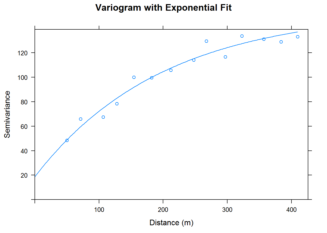
cal.kriged <- krige(data ~ 1, cal.train, cal.test, model = cal.train.fit)## [using ordinary kriging]cal.kriged %>% as.data.frame %>%
ggplot(aes(x=east, y = north)) +
geom_tile(aes(fill= var1.pred), height = 20, width = 20) +
coord_equal() +
scale_fill_gradientn( colours = myPalette(100)) + #scale_fill_gradient(low = "yellow", high = "red") +
scale_x_continuous(labels=comma) +
scale_y_continuous(labels=comma) +
theme_bw() + ggtitle("Test Sample Kriging Predictions") + xlab("Easting (m)") + ylab("Northing (m)") +
labs(fill = c("Calcium \nContent"))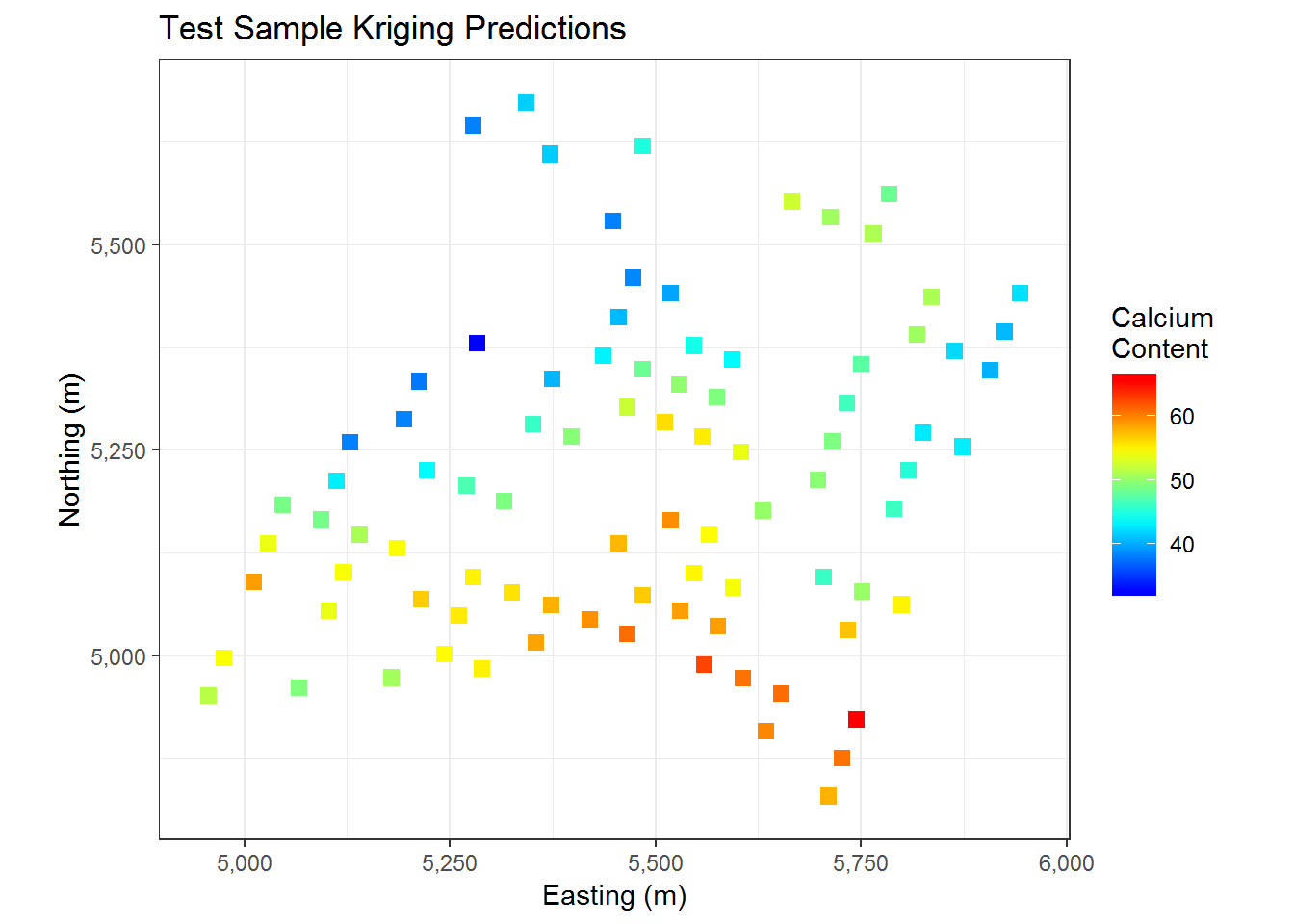
We have the results of kriging on our testing data above. Our predictions indicate that the Southern section of the map has a higher calcium content while the middle North section of the map has a slightly lower calcium content. Below we do some error estimation to get a clue as to how closely our results match the actual values of our testing data.
rmse <- sqrt(mean(((cal.test$data - cal.kriged$var1.pred)^2)))

ap <- cbind(actual = cal.test$data, predicted = cal.kriged$var1.pred)
ap.df <- as.data.frame(ap)
ggplot(ap.df, aes(x = predicted, y = actual)) +
  geom_point() +
  geom_abline(intercept = 0, slope = 1, color="red", size = 1) +
  coord_fixed() + ggtitle("Predicted Versus Actual Values") +
  xlab("Predicted Values") + ylab("Actual Values")
We end up with a root mean square error (RMSE) of 7.7294397. This is not that meaningful due to a lack of other models to compare it to, but it seems alright. From a visual perspective we can see how our predicted values compare to the actual values. Ideally our points should be close to the red line above. Our points do seem to at least slightly follow the curve. This indicates that our predicted values tend to be within a reasonable margin of the true value. If we used our entire dataset we could likely get even better predictions.
We now consider a model based on our entire dataset. Since we will be fitting all of our data in this model, we will not be able to calculate RMSE as before; but let’s see what type of predictions we have from our model. First we generate a grid of points for kriging. The grid we create has 896,460 data points in it.
cal.box <- bbox(calcium_temp)
cal.frame <- expand.grid(cal.box[1,1]:cal.box[1,2], cal.box[2,1]:cal.box[2,2])
colnames(cal.frame) <- c("east", "north")
coordinates(cal.frame)  <- ~ east + north
coordinates(cal.df) <- ~ east + north
We now fit our entire dataset of 178 points to a variogram. We then use our variogram to create an exponentially fitted model. Finally, we perform kriging on our grid of spatial points. We obtain the following graphs.
# variogram for fitted data
cal.df.vgm <- variogram(data~1, cal.df)
cal.df.fit <-fit.variogram(cal.df.vgm, model = vgm(psil=125, model="Exp", range=400, nugget =50)) # use "Sph" for spherical
plot(cal.df.vgm, cal.df.fit, xlab = "Distance (m)", ylab = "Semivariance",
     main = "Variogram with Exponential Fit")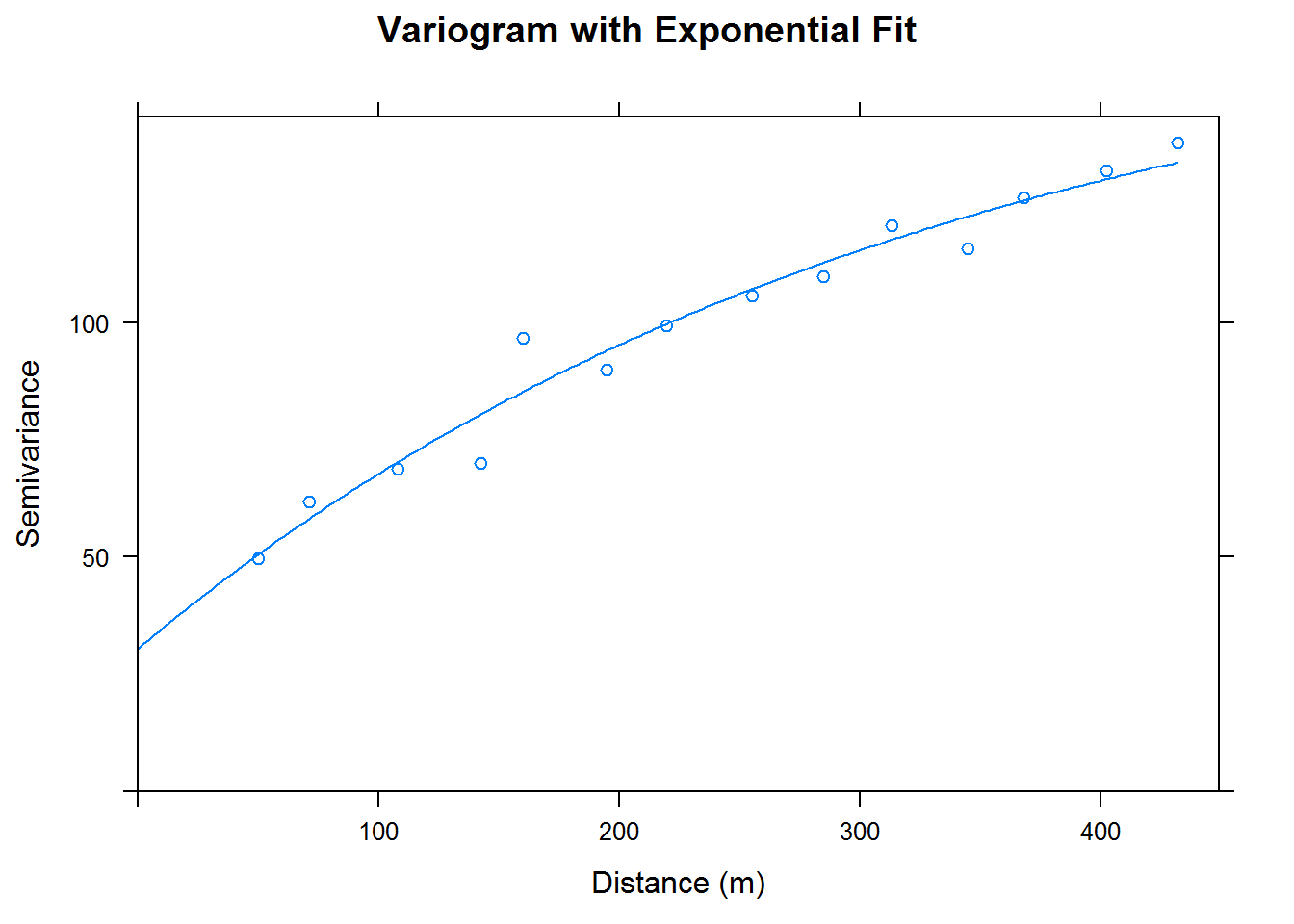
cal.kriged <- krige(data ~ 1, cal.df, cal.frame, model = cal.df.fit)## [using ordinary kriging]cal.kriged %>% as.data.frame %>%
ggplot(aes(x=east, y = north)) +
geom_tile(aes(fill= var1.pred)) +
coord_equal() +
scale_fill_gradientn(colours = myPalette(100)) + #scale_fill_gradient(low = "yellow", high = "red") +
scale_x_continuous(labels=comma) +
scale_y_continuous(labels=comma) +
theme_bw() + ggtitle("Grid Sample Kriging Predictions") + xlab("Easting (m)") + ylab("Northing (m)") +
labs(fill = c("Calcium \nContent"))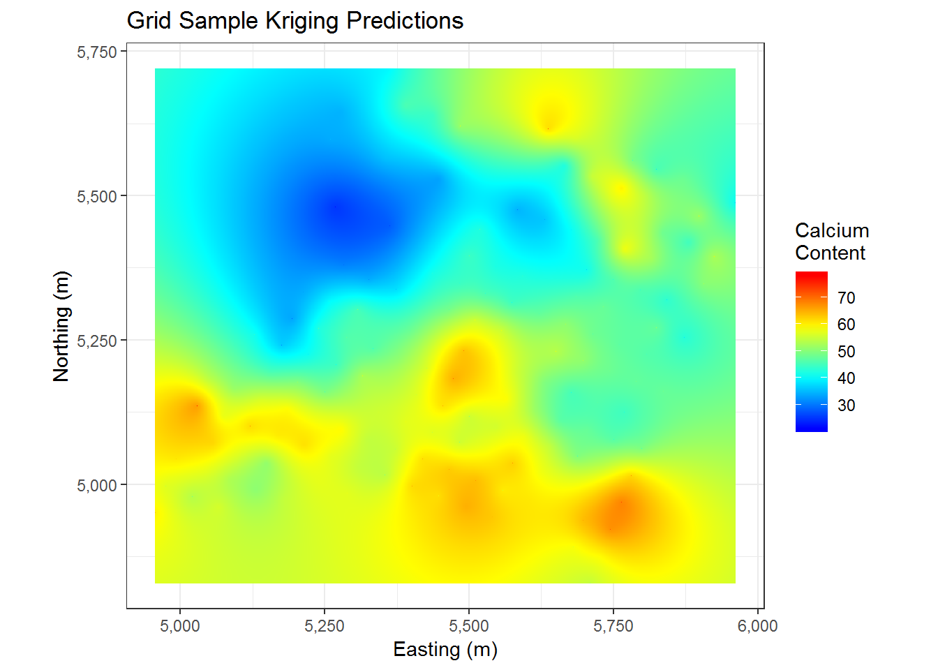
Having used so many points, we end up with a pretty nice looking plot of predicted values. This seems to roughly follow the pattern of the data that we have already seen in the original data and in our prior kriging. We now have a very smooth surface to look at and thousands of predictions for our grid of points. The main thing we may wonder about now is how accurate our predictions are. Well, conveniently we have estimates for that. We plot the variance of our predictions below.
cal.kriged %>% as.data.frame %>%
  ggplot(aes(x=east, y = north)) +
  geom_tile(aes(fill = var1.var)) +
  coord_equal() +
  scale_fill_gradient(low = "yellow", high = "purple") +
  scale_x_continuous(labels=comma) +
  scale_y_continuous(labels=comma) +
  theme_bw() + ggtitle("Grid Sample Kriging Error") + xlab("Easting (m)") + ylab("Northing (m)") +
  labs(fill = c("Kriging \nVariance"))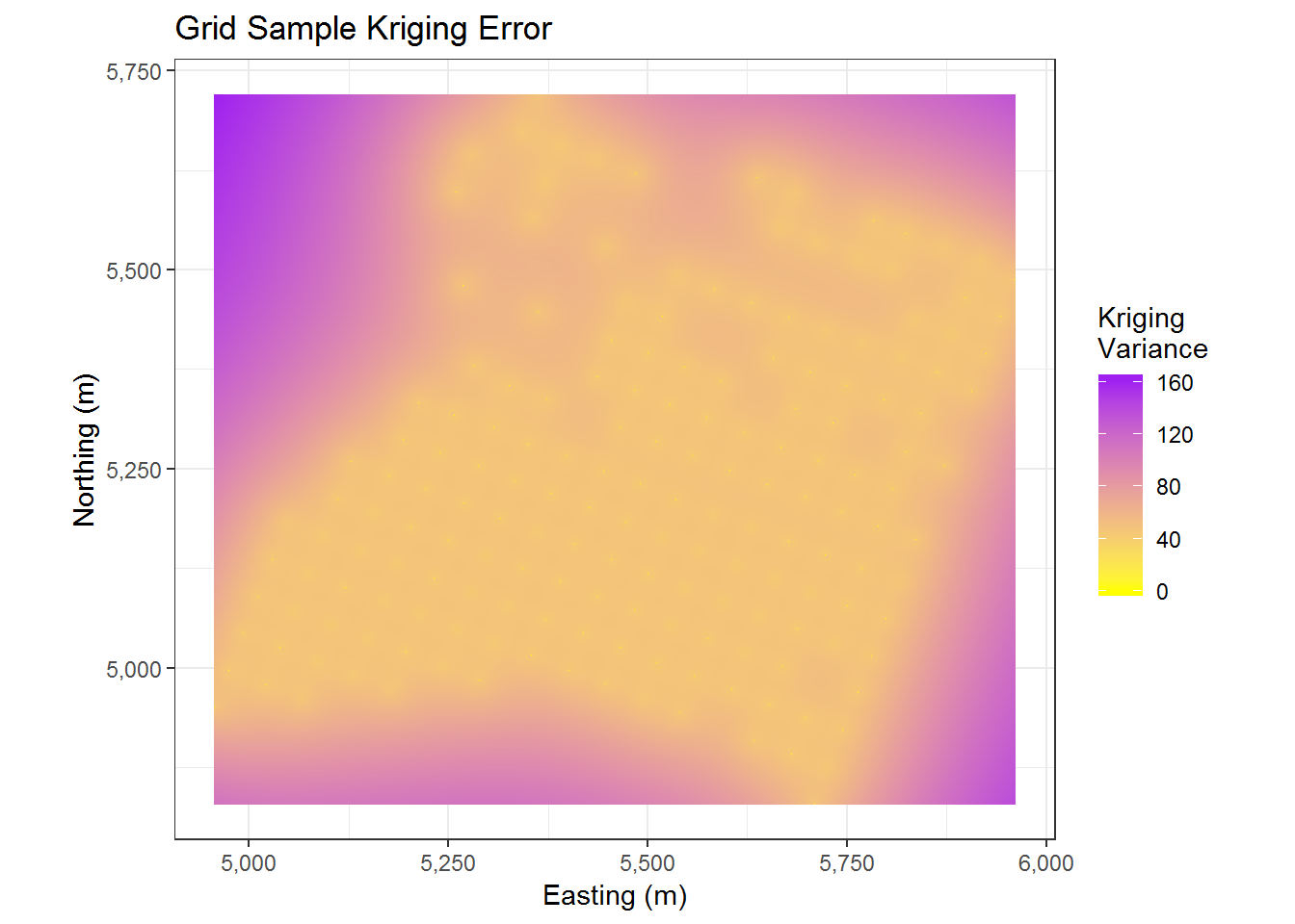
The above graph effectively this tells us that we have higher variance at points further away from our observed data and lower variance at points closer to our observed data. This seems pretty reasonable.
Conclusion
Now that we have predictions for our grid of points and a calculation for the variance of these predictions, we may wonder about improving the model or using the results. For improving the model we can try to utilize the altitude and sub area information that we did not use. Then, if the points we use for kriging contain this additional information, we can likely find better estimates. Additionally, from our current kriging, if our goal is to find regions with high calcium content, then we should search the areas with high predicted calcium content and lower variance. The reason we prefer lower variance is due to the results being more reliable.
This concludes our exploration of kriging. We now have a good method to predict locations with high concentrations of calcium content. We also have a measure of confidence in our predictions; which is always ideal for a statistician and anyone who needs to make decisions.
List of R Packages Used
library(geoR) # contains ca20 data
library(ggplot2)
library(MBA) # needed for mba.surf
library(fields) # needed for image.plot
library(spBayes) # needed for iDist function
library(sp) # needed for coordinates function
library(gstat) # needed for variogram function
library(dplyr) # used for piping
library(scales) # allows comma separation of big numbers in ggplot