Hello. In this post we will be using the ggplot2 package to graph some of the data in the mtcars dataset.
In the first chunk we will look at the structure of the mtcars dataset.
str(mtcars)## 'data.frame': 32 obs. of 11 variables:
## $ mpg : num 21 21 22.8 21.4 18.7 18.1 14.3 24.4 22.8 19.2 ...
## $ cyl : num 6 6 4 6 8 6 8 4 4 6 ...
## $ disp: num 160 160 108 258 360 ...
## $ hp : num 110 110 93 110 175 105 245 62 95 123 ...
## $ drat: num 3.9 3.9 3.85 3.08 3.15 2.76 3.21 3.69 3.92 3.92 ...
## $ wt : num 2.62 2.88 2.32 3.21 3.44 ...
## $ qsec: num 16.5 17 18.6 19.4 17 ...
## $ vs : num 0 0 1 1 0 1 0 1 1 1 ...
## $ am : num 1 1 1 0 0 0 0 0 0 0 ...
## $ gear: num 4 4 4 3 3 3 3 4 4 4 ...
## $ carb: num 4 4 1 1 2 1 4 2 2 4 ...Since mgp represents miles per gallon, we will focus on that as our response variable. For our first plot, we will use hp or horse power as our independent variable. We will use the built in functionality of ggplot2 to plot a linear regression line and its corresponding \(95%\) confidence band.
plot1 <- ggplot(mtcars, aes(x = hp, y = mpg))
plot1 + geom_point() + geom_smooth(level = 0.95, method = "lm") +
  ggtitle("Linear Regression with 95% Confidence Band")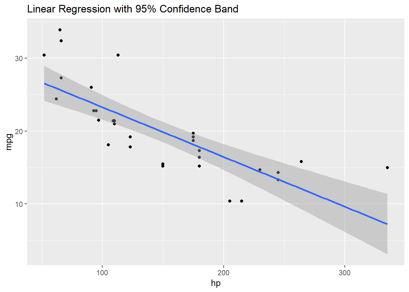
From the above plot, we may have reasonable concerns that the true trend is non-linear. As such, we would like to fit the data to an exponential curve. To do this we will take the log transform of the data, apply linear regression and then plot the exponential of the curve. Our code, including a summary of fitted line are below.
expfit <- lm(data = mtcars, log(mpg) ~ hp)
summary(expfit)
##
## Call:
## lm(formula = log(mpg) ~ hp, data = mtcars)
##
## Residuals:
## Min 1Q Median 3Q Max
## -0.41577 -0.06583 -0.01737 0.09827 0.39621
##
## Coefficients:
## Estimate Std. Error t value Pr(>|t|)
## (Intercept) 3.4604669 0.0785838 44.035 < 2e-16 ***
## hp -0.0034287 0.0004867 -7.045 7.85e-08 ***
## ---
## Signif. codes: 0 '***' 0.001 '**' 0.01 '*' 0.05 '.' 0.1 ' ' 1
##
## Residual standard error: 0.1858 on 30 degrees of freedom
## Multiple R-squared: 0.6233, Adjusted R-squared: 0.6107
## F-statistic: 49.63 on 1 and 30 DF, p-value: 7.853e-08(intercept <- expfit$coefficients[1])## (Intercept)
## 3.460467(slope <- expfit$coefficients[2])## hp
## -0.003428734expfun <- function(x){exp(intercept + x * slope)}
plot1 + geom_point() + stat_function(fun = 'expfun')+
ggtitle("Exponential Fit")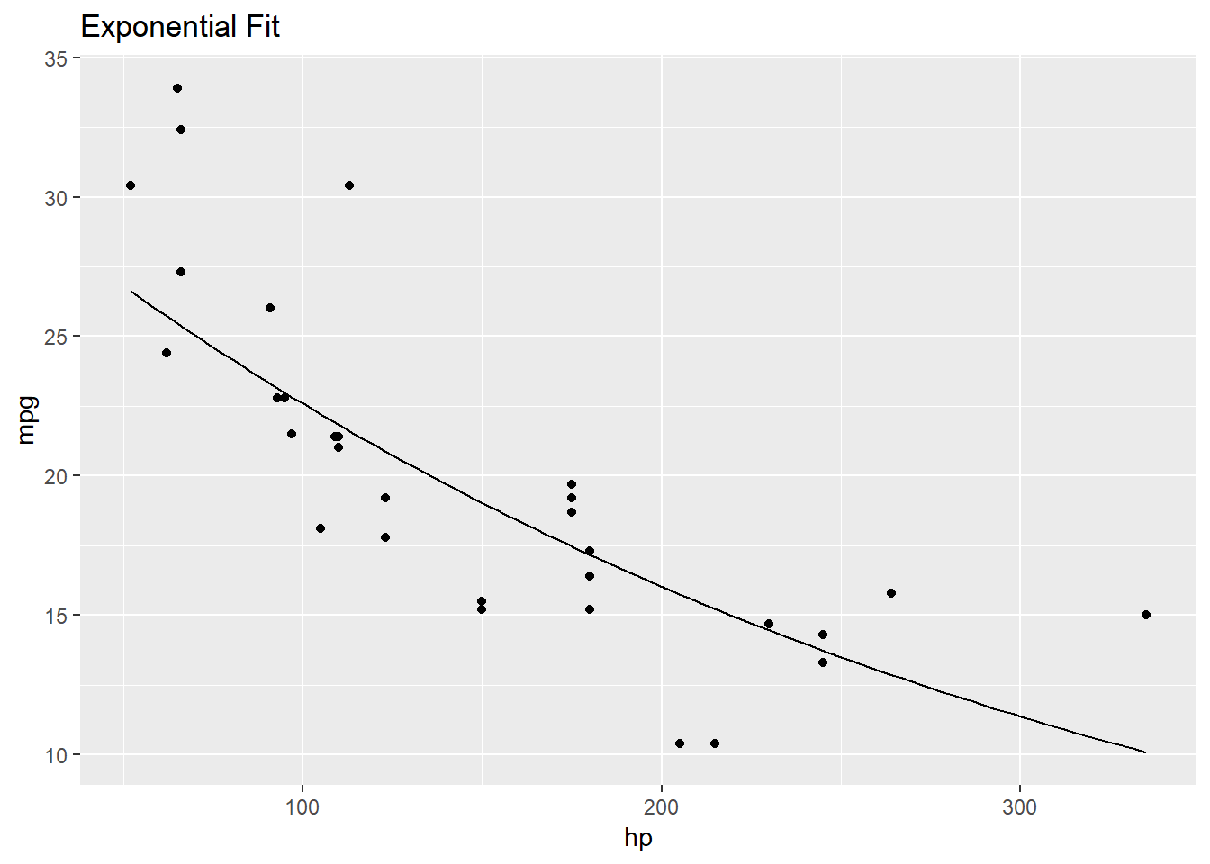
The above graph appears to be a better fit for the data and we will not have to worry about high horse power vehicles getting negative miles per gallon with this curve.
We finish this post by replacing our independent variable hp with the categorical variable cyl. We will demonstrate how ggplot2 does box plots with mpg as the response variable.
ggplot(mtcars, aes(x = factor(cyl), y = mpg)) +
  geom_boxplot() +
  ggtitle("Box Plot")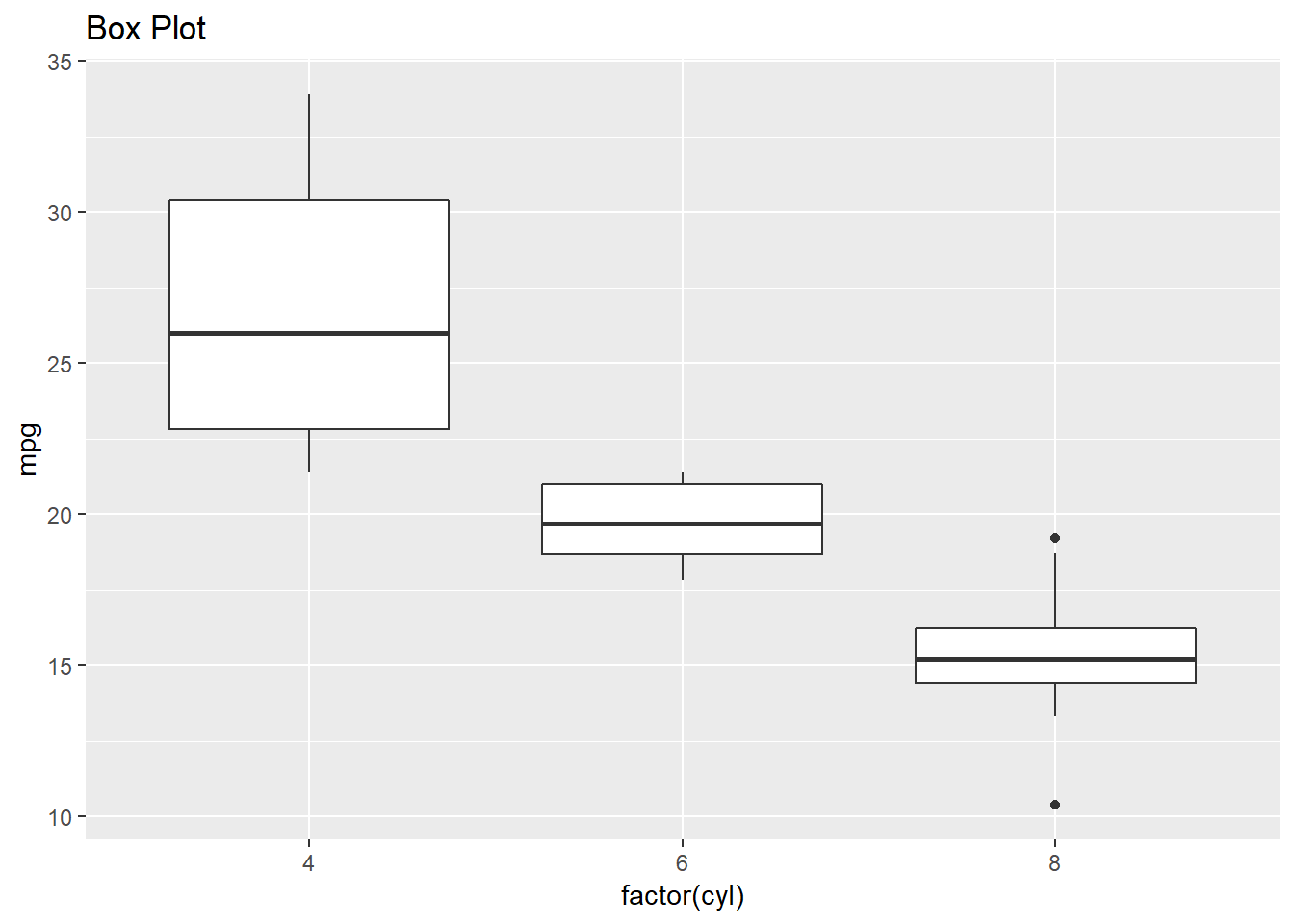
This concludes our brief exploration of the mtcars dataset using ggplot2.